Tag Archive for: Groundwater
Better Tools for Remediation Projects
[sc_vimeo width=”640″ height=”360″ aspect_ratio=”16:9″ video_id=”848525198″ style=”default” position=”right”]
In this short video Africa Espina, Manager of Environmental Services, discusses Locus Technologies’ expertise in site investigation and characterization services. Locus utilizes cutting-edge tools and techniques to conduct thorough site investigations. This includes site reconnaissance, sampling, and monitoring to assess soil, groundwater, surface water, and air quality.
By employing both traditional and innovative sampling methods, such as direct push technology and high-resolution site characterization, Locus ensures accurate and representative data collection.
Watch the video to learn more.
[sc_button link=”https://vimeo.com/848525198″ text=”Watch the video” link_target=”_self” color=”000000″ background_color=”52a6ea”]
Request a demo
Send us your contact information and a Locus representative will be in touch to discuss your organization’s needs and provide an estimate, or set up a free demo of our enterprise environmental software solutions.
EIM Search Tool – Vlog
[sc_vimeo width=”640″ height=”360″ aspect_ratio=”16:9″ video_id=”814747329″ style=”default” position=”right”]
The EIM platform lets the user perform successful searches through various methods. In all searches, the user does not need to specify if the search term is a menu item, help page, or data entity such as parameter or location. Rather, the search bar determines the most relevant results based on the data currently in EIM.
Locus Technologies President, Wes Hawthorne tells us in this video how useful he finds this feature on the EIM platform.
[sc_button link=”https://www.locustec.com/blog/quick-search-and-natural-language/” text=”Click here to learn more” link_target=”_self” color=”000000″ background_color=”52a6ea”]
Request a demo
Send us your contact information and a Locus representative will be in touch to discuss your organization’s needs and provide an estimate, or set up a free demo of our enterprise environmental software solutions.
Finding the Best Environmental Sampling Tool
There is a need for most water entities to centralize data, and more easily load, share, analyze, and report data. Locus Technologies’ customizable software makes scheduling and collecting routine water samples is made easy by using Locus Mobile and EIM. Below is a list of frequent challenges that customers have encountered during their water sampling process and how they can be solved using the right tools from Locus. or better communications.
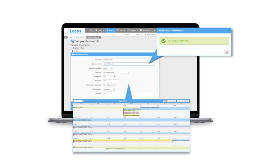
Challenge 1: Finding a flexible sampling planning tool
Planning tools need to allow flexibility in terms of different sampling intervals and date ranges, different field and analytical parameters, and account for location grouping. Using a well-designed application can pull together all of this detailed information and can provide a summary view of the individual samples. A manager can easily view sample status, and whether the sample is complete, in process, or planned. A well-designed application can also generate the chain of custody (COC), and lab and sample shipping date information and labels per sample, which is a huge time saver. This type of sample tracking detail seemed to be very useful to many conference attendees to help ensure they are in regulatory compliance with required sampling frequencies. A key feature to look for is an application that is flexible enough that it can allow one-time, unplanned sample events such as water main breaks, customer complaints and schedule changes, and can handle complex multi-year routine sampling with ease. As a plus, it’s easy for you or your manager to know where you stand at any time.
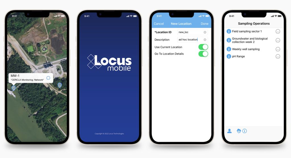
Challenge 2: Eliminating data entry errors caused by hand data entry
Data entry errors and fixing bad data when it was transcribed from field notes to Excel or other programs is a persistent problem with the old way of doing things. Your company needs a better way to streamline the error prone data collection process. Many clients are interested in an alternative to the pencil/paper/clipboard method and had goals to move to tablet or smartphone for data collection. The universal wish list for mobile field applications included:
- Easy to use and set up
- Built in data validation to catch data entry errors at the source
- Direct upload to a data system so the end of the day all the daily samples were in the system with the push of a button
- Prepopulating locations especially for large water systems
- Complete field instructions for samplers on what to collect and where to collect it to eliminate missed samples
- Smart tracking to know on a daily/weekly basis, what samples were collected and what samples were still outstanding
- Integrated with sample planning tools (See challenge 1) to automate the sampling instructions and track the data collection activities vs plan
Challenge 3: Getting the most out of their software, especially regarding updates
Everyone is aware that software updates all the time. Sometimes its security enhancements and sometime feature enhancements or bug fixes. A source of frustration is getting a software update and not knowing what was updated or how best to incorporate a new feature/enhancement into their established process. There was also concern for impact to an established routine with field crews that were used to the existing way of doing things. Even if a functionality improved the workflow, enhancements are only valuable to a user if they understand how to use them and how to incorporate them into their existing process.
Some suggestions from the attendees included:
- Concurrent documentation updates with software updates
- “Quick start” guides for new functionality
- Online training on the new functionality with recording for later viewing
- Heads up on what is coming in the next several months so they can do strategic planning (sharing the roadmap)
- Sandbox environment to test the enhancements before going in production so they can plan how to incorporate the features into their process and train field crews
Mobile applications, which appear very simple to the users, are in reality complex software and require careful integration with the receiving database for a range of complex use cases. This makes rolling out new mobile features challenging for both the developers and the users. Enhanced customer/developer communication along with a sandbox environment can go a long way towards solving some of the inherent issues with rapid innovations and updates associated with cloud and mobile software.
Software tools are available and can solve a lot of the common data management challenges, but know what you want, know the problem you are trying to solve and know it will take some time and effort, but the end result will significantly improve your business processes. Though these challenges are present when choosing a software, Locus Technologies has the experts to help you hurdle the challenges to find the solution that is best for your business.
Request a demo
Send us your contact information and a Locus representative will be in touch to discuss your organization’s needs and provide an estimate, or set up a free demo of our enterprise environmental software solutions.
Simplify Your Water Tracking with Locus Platform
Tracking your data is made easy within our software as a service (SaaS), Locus Platform (LP). Your company can take advantage of LP’s mobile-aware browser functions, giving you the capability to do all your fieldwork with your existing phones or tablets. When cellular connections are unavailable or unreliable, Locus also has a Mobile app which supports the offline capabilities you need to keep your workflow going.
Regardless of your mobile approach, each mobile form can be easily configured to capture the data you require in the field such as photos and the sampling results.
Along with easy mobile data collection, Locus Platform can help you to:
- Track and report your daily results, such as chlorine, nitrite and temperature to water treatment operators, for real time adjustments.
- Monitor lab results from routine sampling.
- Flag out of range data in real time for notifications or data entry corrections.
- Analyze data geospatially to understand situations impacting water quality.
- Report average monthly chlorine results.
- Track water quality complaints and illicit discharges overtime.
- Generate Nitrification Reports.
- Prepare Monthly Flushing reports.
Of course, those are not the limits of Locus Platform. Our software can also help you to:
- Track and manage all types of tasks and regulatory commitments.
- Track any type of permit and associated requirements.
- Generate notifications for defined events, such as data entered above limits.
- Produce PDF and Excel reports for regulators and customers.
- Keep all your information in an easy-to-use secure system and basically future proof your program.
Whether in the office, or out in the field, Locus Technologies is with you every step of the way during the tracking process. Contact us to find your solution.
![]()
Request a demo
Send us your contact information and a Locus representative will be in touch to discuss your organization’s needs and provide an estimate, or set up a free demo of our enterprise environmental software solutions.
Getting More from your Environmental Data using Dashboards with Integrated Mapping
Today is GIS Day, a day started in 1999 to showcase the many uses of geographical information systems (GIS). Earlier Locus blog posts have explained how GIS and maps support visualization of objects in space and over time. This post covers a specific visualization method called data dashboards.
A data dashboard is a combination of charts, maps, text, and images that enables analysis of data and thereby promotes discovery of previously unknown relationships in the data. Companies and organizations use dashboards to develop insight into the overall status of a company or of a company division, process, or product line. Dashboards are also a common function in ‘business intelligence’ applications such as Microsoft Power BI and Tableau. A printed dashboard is static, but an online dashboard can be dynamic; in a dynamic dashboard, interacting with one item on the dashboard causes the other items to update. Taken together, the visualizations on a dynamic dashboard can help you find the story in your data.
One reason dashboards are so helpful is that they allow humans to partially ‘offload’ their thinking. Cognitive research has shown that human ‘working memory’ handles at most four items at a time. A good visualization, however, reduces the number of items to process in memory.
Consider a large table of carbon dioxide emissions by country for multiple years; it can be difficult to keep all the numbers in mind if you are trying to find trends.
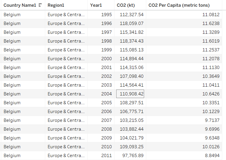
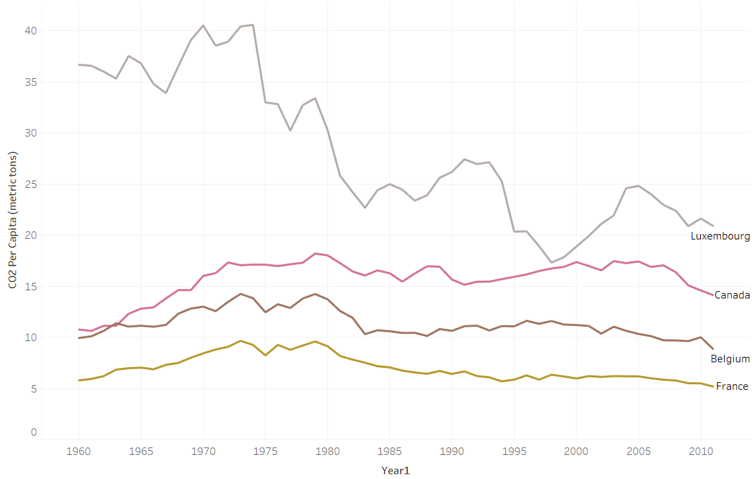
If you plot the data in a graph, however, each series of data in the chart becomes just one line on the graph. It is much easier to compare lines on the chart than to compare columns of numbers.
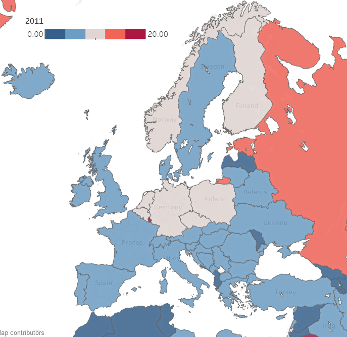
Now consider making a map with countries color coded by emissions. Again, for each country, the map reduces multiple numbers to a single color for that country on the map. You can compare country colors more easily than columns of numbers.
A dashboard that combines multiple visualizations further enhances data analysis. Imagine a dynamic dashboard showing you both the emissions chart and map described above. If you select a country on the map, the chart can highlight the line for that country, so you compare its emissions to other countries over time. Similarly, if you select a line on the chart for a specific country, the map can highlight the selected country to show how its emissions compare to nearby countries. This interactivity lets you drill into your data more effectively than using either the chart or the map by itself.
Here are three examples of effective dashboards that are available online:
- The Covid-19 dashboard from John Hopkins shows a map, charts, and tables of Covid -19 cases.
- The Global Climate Dashboard from NOAA shows charts of multiple climate indicators.
- The Carbon Pricing dashboard from the World Bank lets you drilldown to see carbon pricing initiatives for various nations.
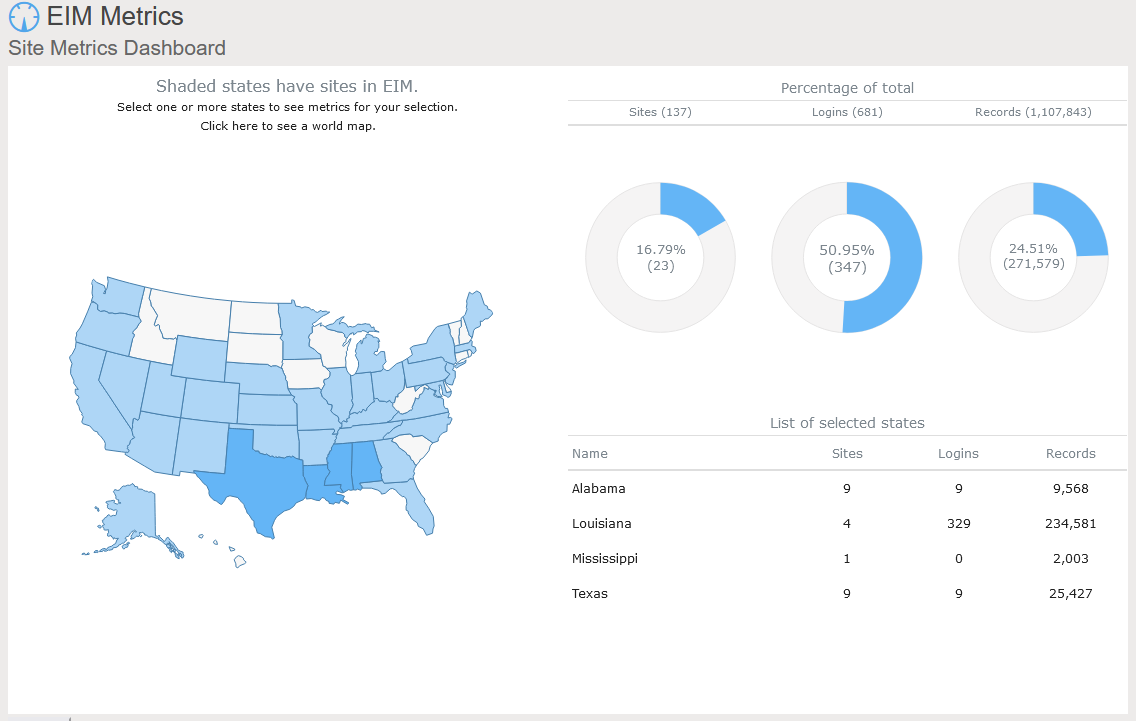
Locus includes data dashboards in our applications. One example is the Site Metrics dashboard in EIM, Locus’s cloud-based, software-as-a-service application for environmental data management. The Site Metrics dashboard lets you perform roll-up queries across your portfolio of sites. A map on the dashboard shows all states with active sites. If you select one or more states, the dashboard updates the charts and tables on the right to show total sites, user logins, and record counts. Other dashboards can support showing sample locations of certain chemicals or counts of regulatory limit exceedances.
A further example comes from the Locus Environmental Social and Governance (ESG) application. ESG metrics are becoming increasingly important measures for an organization’s performance. Data dashboards can help companies quickly visualize trends in their ESG metrics using intuitive mapping tools.
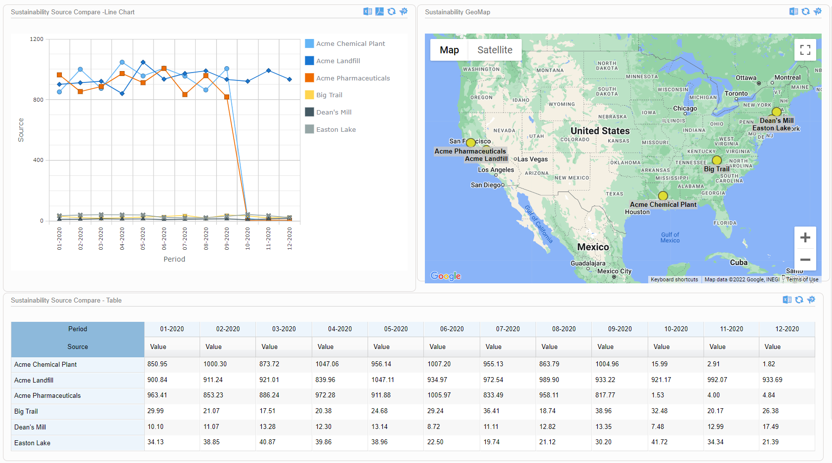
This dashboard illustrates both spatial and time trends and provides the raw data necessary for auditability and transparent decision making. Having these features on a single combined view provides users with instant access to the key inputs for ESG prioritization, planning, and project implementation.
As these examples from Locus show, data dashboards with integrated mapping are important tools for maximizing the value of your collected environmental and ESG data. For any dataset with a geographic component, it’s important to incorporate mapping elements in the outputs, to highlight trends and patterns that may not otherwise be visible in a chart or table. Modern software can combine these output formats in a way that tells the story shown by your data.
Interested in Locus’ GIS solutions?
Locus GIS+ features all of the functionality you love in EIM’s classic Google Maps GIS for environmental management—integrated with the powerful cartography, interoperability, & smart-mapping features of Esri’s ArcGIS platform!
[sc_button link=”https://www.locustec.com/applications/gis-mapping/” text=”Learn more about Locus’ GIS solutions” link_target=”_self” color=”#ffffff” background_color=”#52a6ea” centered=”1″]
[sc_image width=”150″ height=”150″ src=”16303″ style=”11″ position=”centered” disable_lightbox=”1″ alt=”Dr. Todd Pierce”]
About the Author—Dr. Todd Pierce, Locus Technologies
Dr. Pierce manages a team of programmers tasked with development and implementation of Locus’ EIM application, which lets users manage their environmental data in the cloud using Software-as-a-Service technology. Dr. Pierce is also directly responsible for research and development of Locus’ GIS (geographic information systems) and visualization tools for mapping analytical and subsurface data. Dr. Pierce earned his GIS Professional (GISP) certification in 2010.
The Convergence of Augmented Reality and GIS
Today is GIS Day, a day started in 1999 to showcase the many uses of geographical information systems (GIS). Earlier blog posts by Locus Technologies for GIS day have shown how GIS supports cutting-edge visualization of objects in space and over time. This year’s post explains how GIS supports augmented reality.
Augmented reality (AR) is a technology that enhances how we experience the real world by overlaying your surroundings with computer-generated objects. It differs from virtual reality (VR) because in VR, everything you see is computer generated, but in AR, the majority of what you see is real – your experience of reality is enhanced (augmented) but not totally replaced.
You are probably familiar with one AR application already if you watch American football. The ‘virtual’ first down line that appears on field before each play is projected there by computer and is not really painted on the field. If you follow soccer (or football to the rest of the world), AR is used by a Video Assistant Referee (VAR) to objectively determine tight offsides decisions. Digital lines are drawn across the field to show whether or not attackers are illegally past the last defender or not. Another AR example is the popular game Pokémon Go that shows cute virtual creatures in your living room or your front yard.
To experience AR, you need something to project the non-real objects onto your view of the world. Many AR applications use mobile phones or other devices. An AR application uses the camera view to show you the world around you and then overlays virtual objects onto the view. Other devices such as head mounted displays, ‘smart glasses’, or even ‘bionic contact lenses’ can use AR, but have not been as popular as phones or other mobile devices. In contrast to AR, VR cannot be fully supported with just a mobile device and usually requires headsets to immerse you in a virtual world. Because of this need, AR is much less intrusive than VR is.
Countless other examples of AR already exist in many fields. A few selected applications include:
- Online shoppers at some e-commerce sites can use smart devices to project furniture into their home to see how the pieces look before making a purchase.
- Some clothing stores can project clothing onto shoppers’ bodies to check appearance without having to change clothes. These applications require the user to be in a special dressing booth with full body scanning capabilities.
- Urban planners use AR to display how planned buildings, cell towers, wind turbines, and other structures would look in the existing space. Planners can walk the streets and view how proposed projects would alter the existing cityscape.
- AR is used in manufacturing to display operation and safety instructions in a worker’s field of vision using head mounted displays, which circumvents the need to refer to bulky paper manuals.
- Utility managers can see underground pipelines, water lines, sewer pipes, electrical lines, and other infrastructure projected below their feet.
So how does GIS relate to AR? There are three main uses of GIS in AR:
- Location: Any AR application must know where the user is and where to place virtual objects. In most cases, full GIS capabilities are not needed; instead, the application accesses a GPS (global positioning system) to find locations. Consider the Pokémon Go application mentioned before. The game knows where the various Pokémon need to appear. When a user plays the game, it uses GPS to find the user, and then shows any Pokémon that are near the user based on their locations.
- Layers: An AR application may need to show features that are not visible to the user, such as underground electrical lines, earthquake fault lines, property lines, or planned buildings. All these features can be stored as GIS map layers in the cloud and then displayed in the AR application as virtual overlays projected on the real world. Furthermore, a user could select a displayed item and view related attribute information in the GIS layer. For example, a user could view the condition, age, and repair status of a selected water pipeline.
- Navigation: An AR application may also need to help a user get from point A to point B, for example in a crowded airport or in a large warehouse. Such navigation could be facilitated by showing virtual route markers and arrows on the real world.
Locus has been exploring environmental uses of AR and GIS by adding AR to Locus Mobile, which is the Locus app for collecting field data, completing EHS audits, tracking waste containers, and completing other tasks requiring users to gather data out of the office. Locus Mobile now features an AR mode to assist users when taking field samples. When the user activates AR mode, the app uses the camera to show the user’s immediate area. The app then puts multiple virtual markers on the display corresponding to sampling points located in that direction. As the user moves or rotates the phone to change the viewing area, the markers change to reflect the locations in the user’s line of sight. Clicking a marker provides more information including the location name and the distance from the user.
Locus Mobile uses all three ways to combine GIS with AR:
- By using GPS to find the user’s location and the locations of nearby sampling points.
- By using GIS to display the layer of sampling points.
- By using GIS to assist with navigation to sampling points by showing distance and direction.
Here is a sample image from Locus Mobile showing three nearby sampling locations along with information about past events or measurements at the locations. The three blue banners are the augmented reality displayed on top of the view of the nearby surroundings.
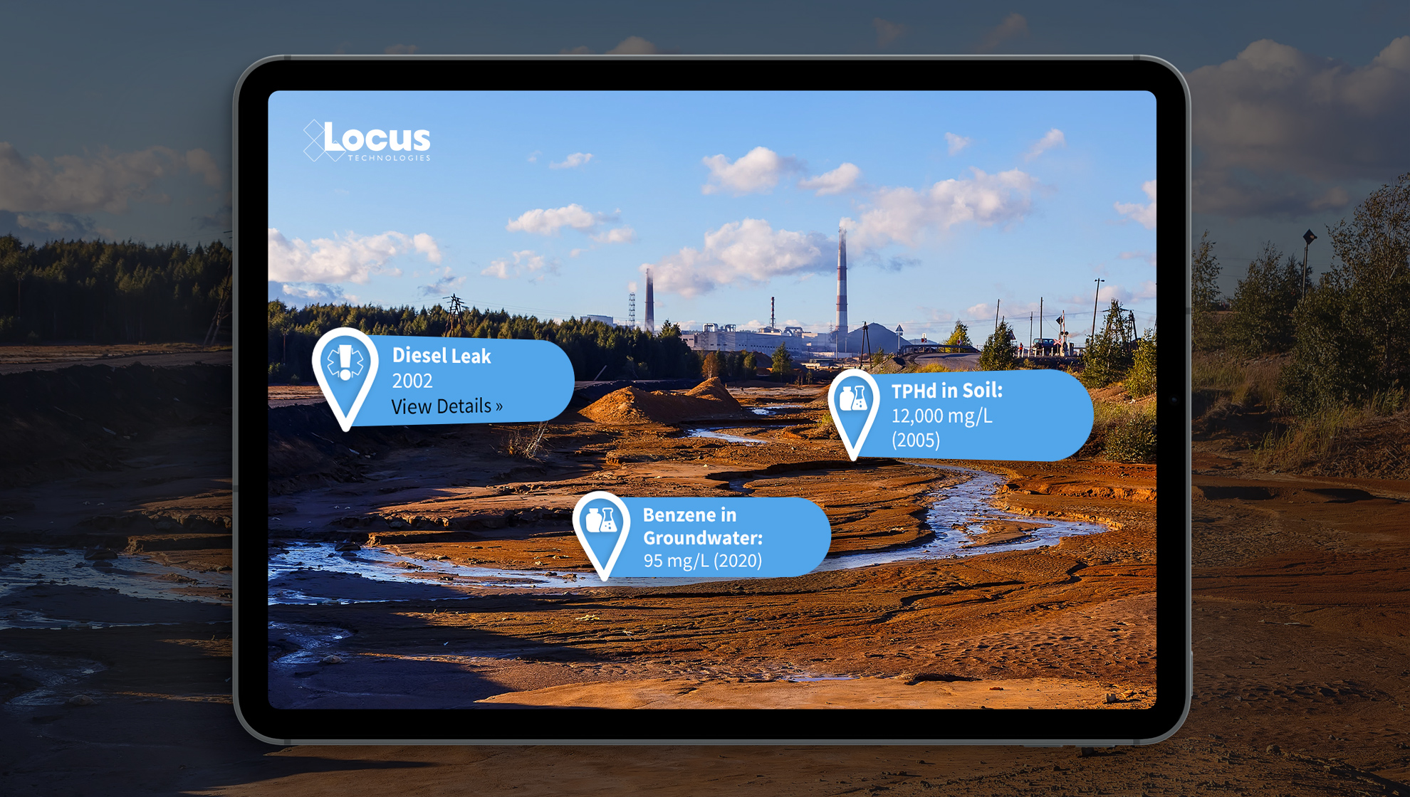
By using GIS and AR to assist users in finding sampling points, Locus Mobile makes field personnel more productive. Samplers can find field locations quickly and can easily pull up related information. Locus continues to explore using AR to expand the functionality of its environmental applications.
Interested in Locus’ GIS solutions?
Locus GIS+ features all of the functionality you love in EIM’s classic Google Maps GIS for environmental management—integrated with the powerful cartography, interoperability, & smart-mapping features of Esri’s ArcGIS platform!
[sc_button link=”https://www.locustec.com/applications/gis-mapping/” text=”Learn more about Locus’ GIS solutions” link_target=”_self” color=”#ffffff” background_color=”#52a6ea” centered=”1″]
[sc_image width=”150″ height=”150″ src=”16303″ style=”11″ position=”centered” disable_lightbox=”1″ alt=”Dr. Todd Pierce”]
About the Author—Dr. Todd Pierce, Locus Technologies
Dr. Pierce manages a team of programmers tasked with development and implementation of Locus’ EIM application, which lets users manage their environmental data in the cloud using Software-as-a-Service technology. Dr. Pierce is also directly responsible for research and development of Locus’ GIS (geographic information systems) and visualization tools for mapping analytical and subsurface data. Dr. Pierce earned his GIS Professional (GISP) certification in 2010.
Automate Your Vapor Intrusion Management
The Vapor Intrusion tools in Locus’ Environmental Information Management (EIM) software solve the problem of time-consuming monitoring, reporting, and mitigation by automating data assembly, calculations, and reporting.
Quickly and easily generate validated reports in approved formats, with all of the calculations completed according to your specific regulatory requirements. Companies can set up EIM for its investigation sites and realize immediate cost and time savings during each reporting period.
Contact us to see the Vapor Intrusion tool in action
Send us your contact information and a Locus representative will be in touch to discuss your organization’s environmental data management needs and provide an estimate, or set up a free demo of our enterprise environmental software solutions.
Utilizing the Uniqueness of GIS for Better Environmental Data Analysis
Today is GIS Day, a day started in 1999 to showcase the many uses of geographical information systems (GIS). Earlier Locus blog posts have shown how GIS supports cutting-edge visualization of objects in space and over time. This post is going to go “back to basics” and discuss what makes GIS unique and how environmental data analysis benefits from that uniqueness.
Spatial vs Non-Spatial Relationships
So, what makes GIS unique? It’s the ability of GIS to handle spatial relationships, which goes beyond just putting “dots on a map”. You are probably familiar with non-spatial relationships such as greater than, less than, or equal to, and you probably use them every day. For example, suppose you want to buy the latest gaming console (PS5, anyone?). You need to compare the price of the console to your bank account. If the console price is greater than your savings, then you cannot buy the console.
Or can you? With credit cards, you can pay later, so you go charge the console. At the time of the transaction, some software evaluates a non-spatial relationship and checks if the console price plus your current debt is less than your credit limit. If so, you can buy the console; if not, your purchase is denied.
The key point about this example is that spatial relations play no part. It doesn’t matter where you are located or where the game console is sold from. (OK, there may be things like state taxes and shipping, but that just contributes to the price.) Now, if you were trying to find all gaming consoles for sale within a certain distance of you, that is a spatial relationship. There are multiple types of spatial relationship, but the most common are inside, contains, crosses, overlaps, and within a distance of. Standard relational database software does not handle these sorts of relations, but GIS can.
As an illustration, let’s consider two current events: the 2020 US presidential election and the COVID-19 pandemic. With non-spatial relationships, you can answer various questions such as “did Biden get more votes than Clinton?” or “is the number of positive COVID tests increasing?”. But with spatial relations, you can answer more interesting questions such as “did areas with COVID hot spots vote more predominantly for Biden or Trump?”. For this question you must see if voters lie inside a COVID hot spot; a GIS can perform this analysis and then map the results. While many votes are still being counted, as of this blog post, it appears Trump performed better in COVID hot spots.
Spatial Relationships in Environmental Data
Let’s look at some example of spatial relations in environmental data. Assume you have a database of tritium sampling results in water, along with various map layers of natural and manmade features. What kind of spatial relationships can you explore with GIS?
To answer that, we’ll make some maps with the Locus GIS+ package in EIM, Locus’s cloud-based, software-as-a-service application for environmental data management. All maps shown here display wells with tritium samples, with the wells represented as colored circles. The color scale goes from blue through yellow to red, to indicate increasing tritium results.
Figure 1 shows an example of an inside spatial relationship. The map answers the question “what wells with tritium results are inside the Mortandad Canyon watershed?”. The watershed is highlighted in blue on the map, and you can easily see the wells inside the watershed.
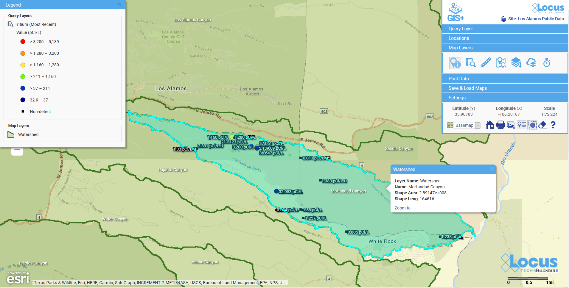
Figure 1: Wells with tritium within a watershed
Figure 2 shows wells with tritium results that are within a distance of a river. The map answers the question “what wells with tritium results are within 500 ft of the river?”. The river, highlighted in light blue, has a 500 ft buffer shown as a dotted blue line. The wells with tritium that lie within the buffer are shown on the map, so you can check if any high tritium results are close to the waterway.
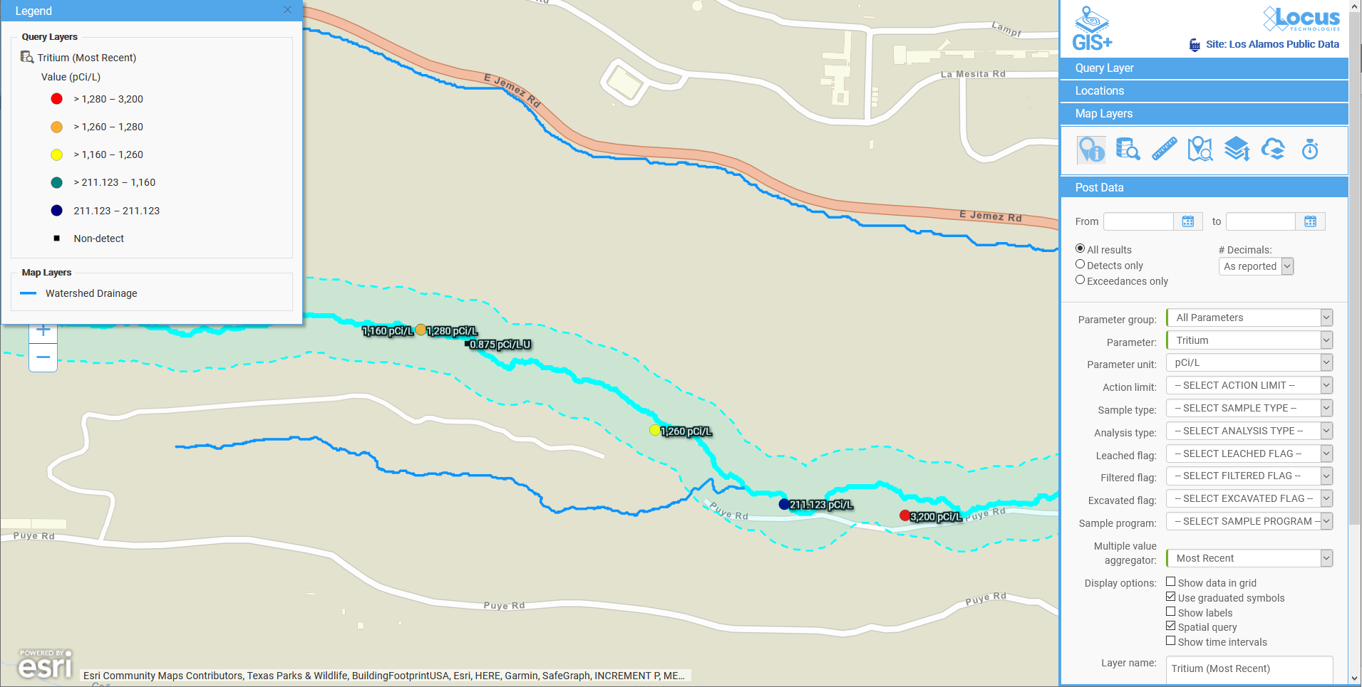
Figure 2: Wells with tritium within a specified distance of a river
Figure 3 shows another example of within a distance of. Here, the map answers the question “what wells with tritium results are within two miles of a middle school?”. The two-mile radius is shown as a shaded blue circle centered on the school. You can see the wells are confined to the area southeast of the school.
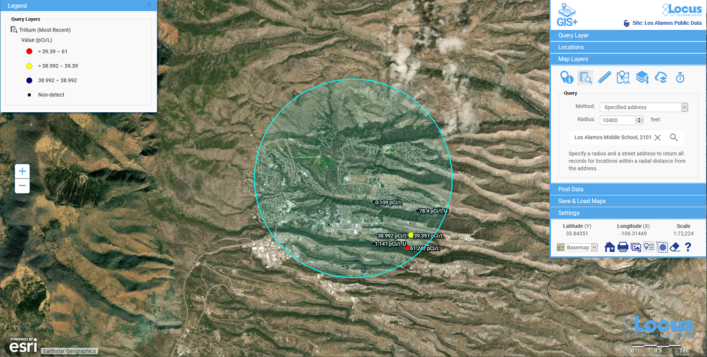
Figure 3: Wells with tritium within a specified distance of a school
These three examples are just a small subset of what can be done with GIS and environmental data. Here are some other questions illustrating the kind of spatial analysis that GIS supports.
- Have any spill incidents at my site been within a specified distance of a waterway?
- Do any pipelines at my site cross protected waterways?
- Do any remediation areas at my site contain wells that have recorded high chemical levels in water?
- Does the underground plume from a chemical release overlap any aquifers?
All these examples illustrate the power of GIS for analyzing spatial relationships, and these examples are just the beginning. GIS can also perform more sophisticated analyses that look at spatial relationships in different ways to answer questions such as:
- How confident can we be in the results of the spatial relationship analysis?
- Do all data records follow the spatial relationship, or are any outliers that fall outside the norms?
- Has this spatial relationship changed over time? Has the relation grown stronger or weaker?
- Can we predict the future of the spatial relationships?
Locus continues to bring new analysis tools to our Locus GIS+ system for environmental applications. These applications let you take advantage of the unique ability of GIS to analyze spatial relationships in your environmental data.
Acknowledgments: All the data in EIM used in the examples was obtained from the publicly available chemical datasets online at Intellus New Mexico.
Interested in Locus’ GIS solutions?
Locus GIS+ features all of the functionality you love in EIM’s classic Google Maps GIS for environmental management—integrated with the powerful cartography, interoperability, & smart-mapping features of Esri’s ArcGIS platform!
[sc_button link=”https://www.locustec.com/applications/gis-mapping/” text=”Learn more about Locus’ GIS solutions” link_target=”_self” color=”#ffffff” background_color=”#52a6ea” centered=”1″]
[sc_image width=”150″ height=”150″ src=”16303″ style=”11″ position=”centered” disable_lightbox=”1″ alt=”Dr. Todd Pierce”]
About the Author—Dr. Todd Pierce, Locus Technologies
Dr. Pierce manages a team of programmers tasked with development and implementation of Locus’ EIM application, which lets users manage their environmental data in the cloud using Software-as-a-Service technology. Dr. Pierce is also directly responsible for research and development of Locus’ GIS (geographic information systems) and visualization tools for mapping analytical and subsurface data. Dr. Pierce earned his GIS Professional (GISP) certification in 2010.
A Visualization is Worth a Thousand Data Points
Visualize environmental data with Locus EIM.
You’ve probably heard the saying “A picture is worth a thousand words”. While the advice seems timeless, it actually is fairly modern and started with newspaper advertisements from the 1910s. Furthermore, it’s only since the 1970s that cognitive science has caught up and determined the truth in the saying. Basically, humans have very limited working memory, which is the “storage space” for processing data while making decisions and reasoning through problems. A good picture, though, works as “offline storage” that lets you push information out of your limited working memory and into another format for use as needed. This advantage is especially true when the picture is a useful data visualization such as a chart or map. In this case, you could say “A visualization is worth a thousand data points”.
How limited is working memory? There is a rough consensus, known as Miller’s law, that you can only have “seven, plus or minus two” items in memory at one time. Think of a typical 10-digit phone number that you may need to memorize for a short period. It can be hard to remember all ten individual digits as one large number, as that exceeds working memory. However, you can employ a technique called “chunking” to group items together, reducing the number of items to remember. If you group the phone numbers into the typical ###-###-#### pattern, you only have to remember 3 chunks of 3 to 4 items. A good visualization not only stores information offline, reducing pressure on your brain; it also groups many data items into a much smaller number of chunks so you can process the data more efficiently.
Let’s look at some real examples of how visualizations help by working through a typical scenario using EIM, Locus Technologies’ cloud-based application for environmental data management. Assume you manage a site where you are tracking tritium (H-3) levels in groundwater using a set of monitoring wells. You want to know where tritium has been high over the past ten years. EIM provides different visualizations for exploring your data and finding the answers you need.
First let’s just look at an export of all the data. Using the analysis functions in EIM, you search for all tritium concentrations from monitoring wells for the past ten years. EIM sends the results to a table as shown in Figure 1.
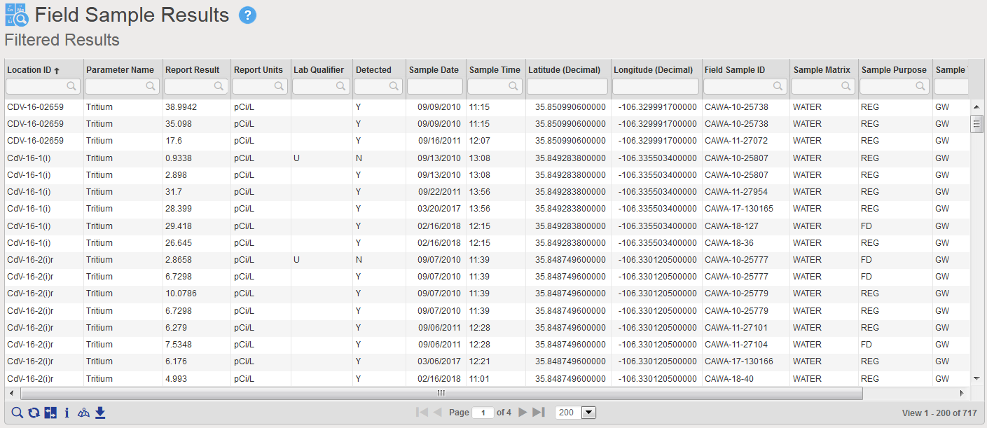
Figure 1 Tabular view of Tritium query results
The table has 717 results for multiple wells. It is very difficult to see overall patterns here, either spatially or temporally. Each of the 717 results is one item, and if you try to scroll and sort the table to see if tritium is increasing or decreasing over time, your working memory is quickly overwhelmed. This is where a good data visualization can help.
To start, you decide to send the data to the Locus GIS+ application, using the graduated color and size options. The GIS+ takes the concentrations from the results table and plots them on a site map using the stored coordinates for each well, as shown in Figure 2. The map represents each location with a symbol that is colored and sized to reflect the actual maximum value at that location. The map legend shows you how this was done. Large red circles, for example, represent results from 4,500 to 7,000 pCi/L. As the sizes get smaller, and the colors go from red to blue, the actual result gets smaller.
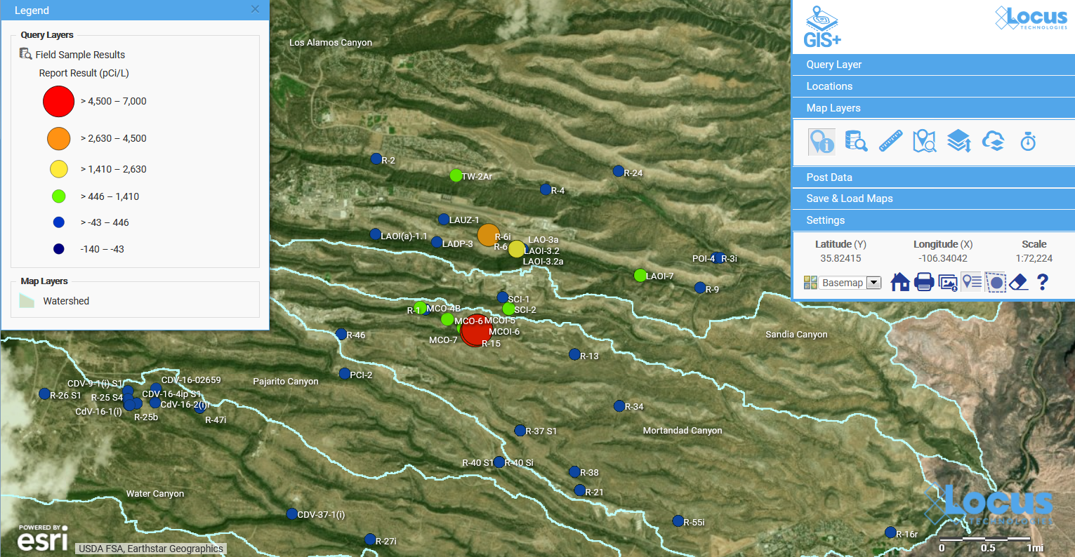
Figure 2 Graduated symbol and color map of tritium concentrations
This map is great for showing spatial patterns in the data. You can easily pick out a couple of “areas of concern” near the center of the map – one with orange and yellow circles, and another with red circles. To revisit our discussion on working memory and chunks, the map takes the 717 results and summarizes them so your brain can quickly pick out the two areas of concern.
Let’s look more closely at the area of concern with higher results. If we zoom in on the map, we see the two red locations are wells MCOI-5 and MCOI-6 as shown in Figure 2.
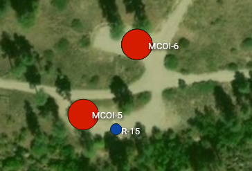
Figure 3 Zoomed map for one area of concern
The map shows you where these two high concentrations of tritium are located. But what if you want to see how the concentrations vary over time? You can make a time series chart in EIM for these wells and include a desired regulatory limit, as shown in Figure 4. The green and blue lines represent the tritium concentrations over time for the two wells. The red line at top shows a regulatory action limit.
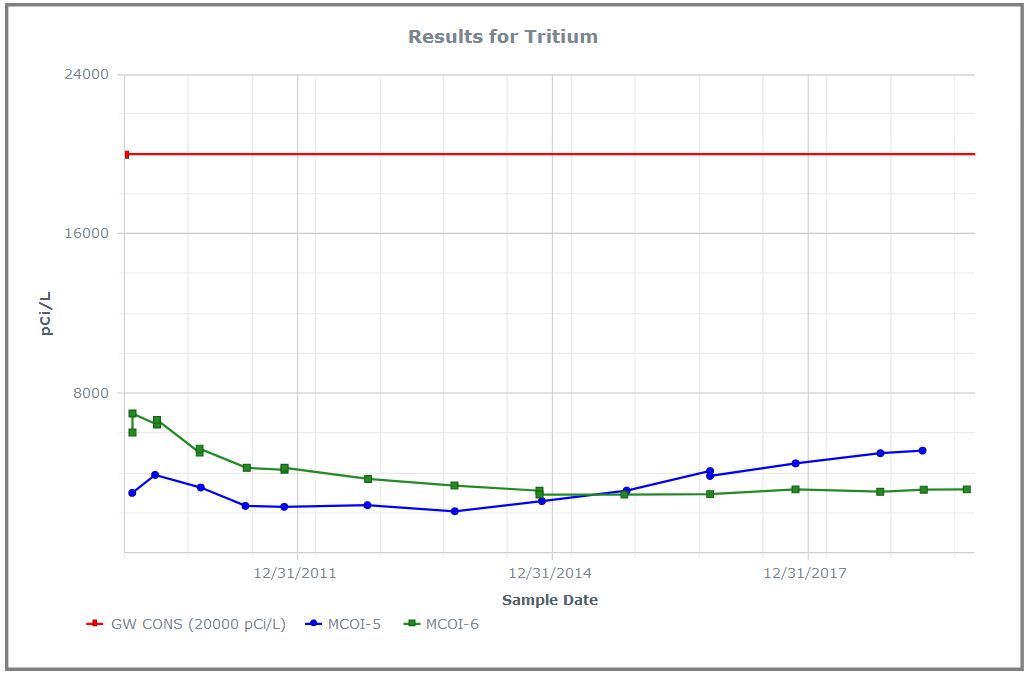
Figure 4 Line chart showing time series for tritium for two wells, with action limit
The chart shows you two important things. First, and most importantly, all the tritium concentrations for both wells lie well below the regulatory action limit! Second, the concentrations have very different trends for the two wells: MCOI-6 started higher but has trended lower, while MCOI-5 started below MCOI-6 but has now surpassed it. You can confirm these general impressions by running concentration regression charts in EIM for the two locations, as shown in Figure 5. The charts show the best fit regression line and the strength of the relation.
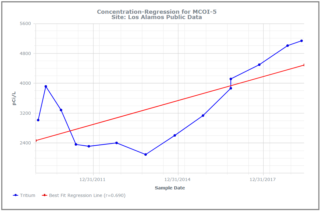
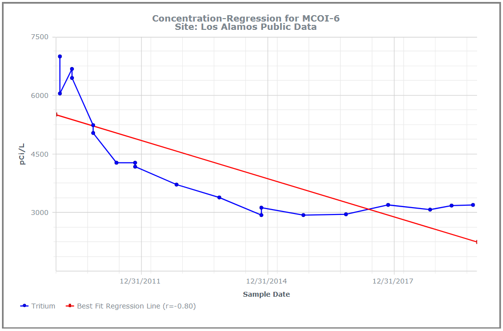
Figure 5 Concentration regression charts in EIM
You can grasp these facts quickly because the of how the chart works. Each series of concentrations for a well consists of multiple data items that are ‘chunked’ into one line on the chart. There are two many individual data points on this chart for your working memory, but only three lines, which can easily be manipulated in your brain. For comparison, Figure 6 shows the actual data values for the chart. The time trends shown above in the charts are not as obvious from the table.
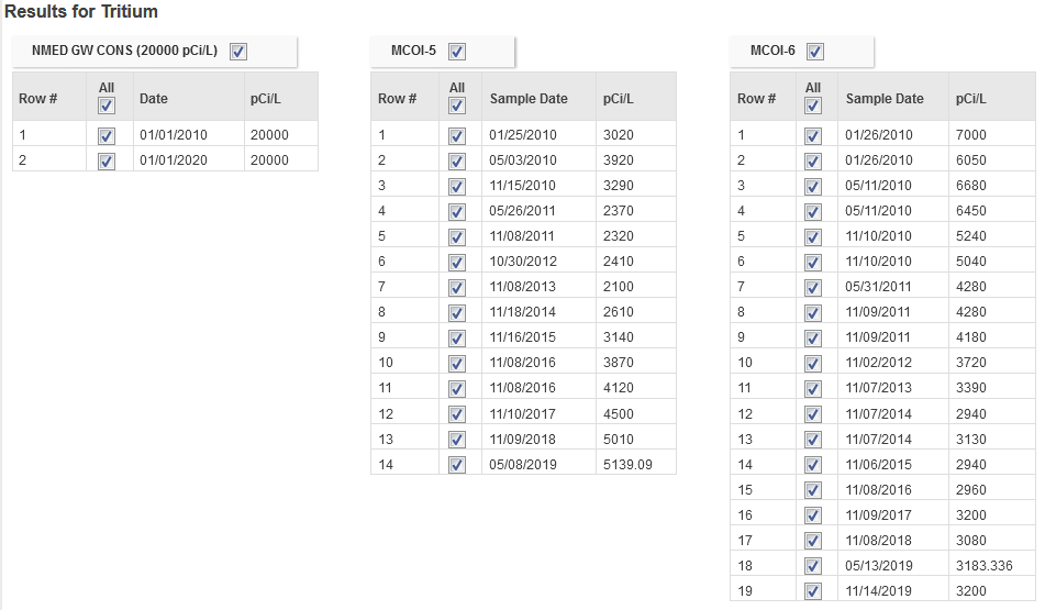
Figure 6 Actual data values for the chart in Figure 4
Now, this might be counter-intuitive, but what if you wanted to put some of these values on the map? While visualizations do help understand data, sometimes it can be useful to have the data shown as well so viewers can see where the visualizations came from. The EIM Data Callouts function can do this. Figure 7 shows data callouts for the two wells. Each callout shows the maximum annual tritium result for 2010-2020. Now you have the actual tritium concentrations located spatially next to the matching wells!
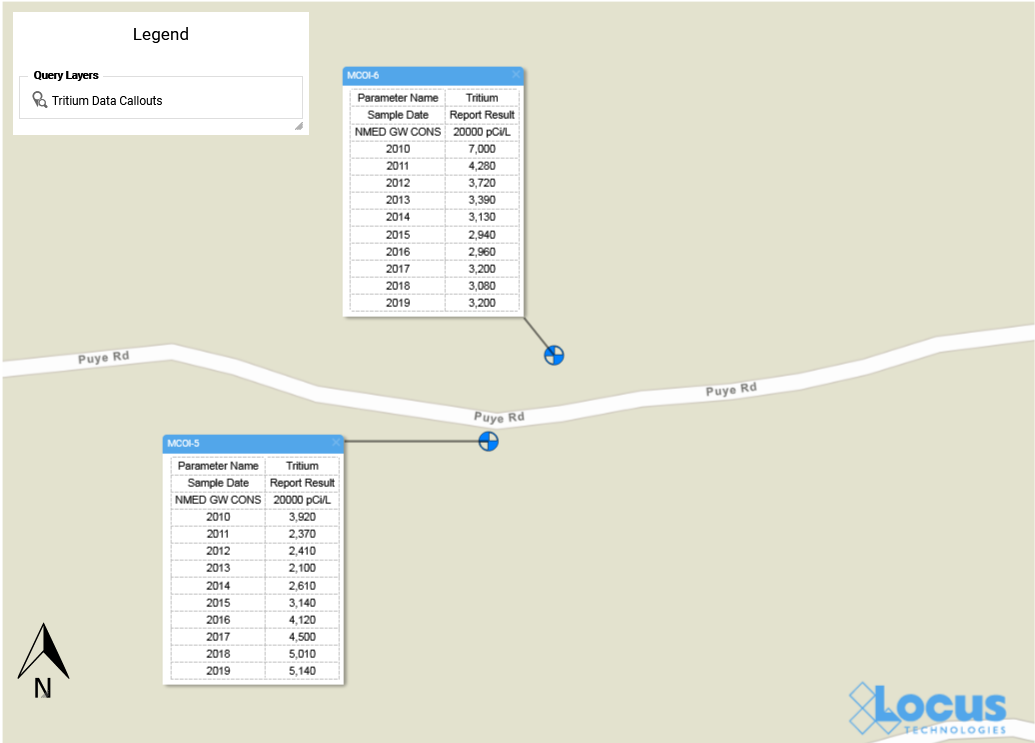
Figure 7 Data Callouts in EIM GIS+
Now that you know where your tritium might be a concern, suppose you want to see what’s going on with groundwater at your site. The EIM contouring module does that for you. There are multiple contouring options, but for this example let’s use the default options for kriging. We know from Figure 2 that the wells MCOI-5 and MCOI-6 are located in the Mortandad Canyon. Figure 8 shows the contouring map generated from EIM for the groundwater wells in that canyon, using the most recent groundwater levels. Higher groundwater values are lighter in color than lower values.
The area of concern is marked with an arrow at upper left. The contour lines and values can help you determine how the tritium might migrate in your site. Imagine trying to picture this just using tables of groundwater readings! With the contour map, the readings turn into lines that can be chunked together for analysis: the higher levels at the upper left forming a “plateau”, the closely packed lines moving across the map to the east, and then the “saddle” area at lower right. These different line patterns carry particular meanings to engineers and scientists who interpret contour maps.
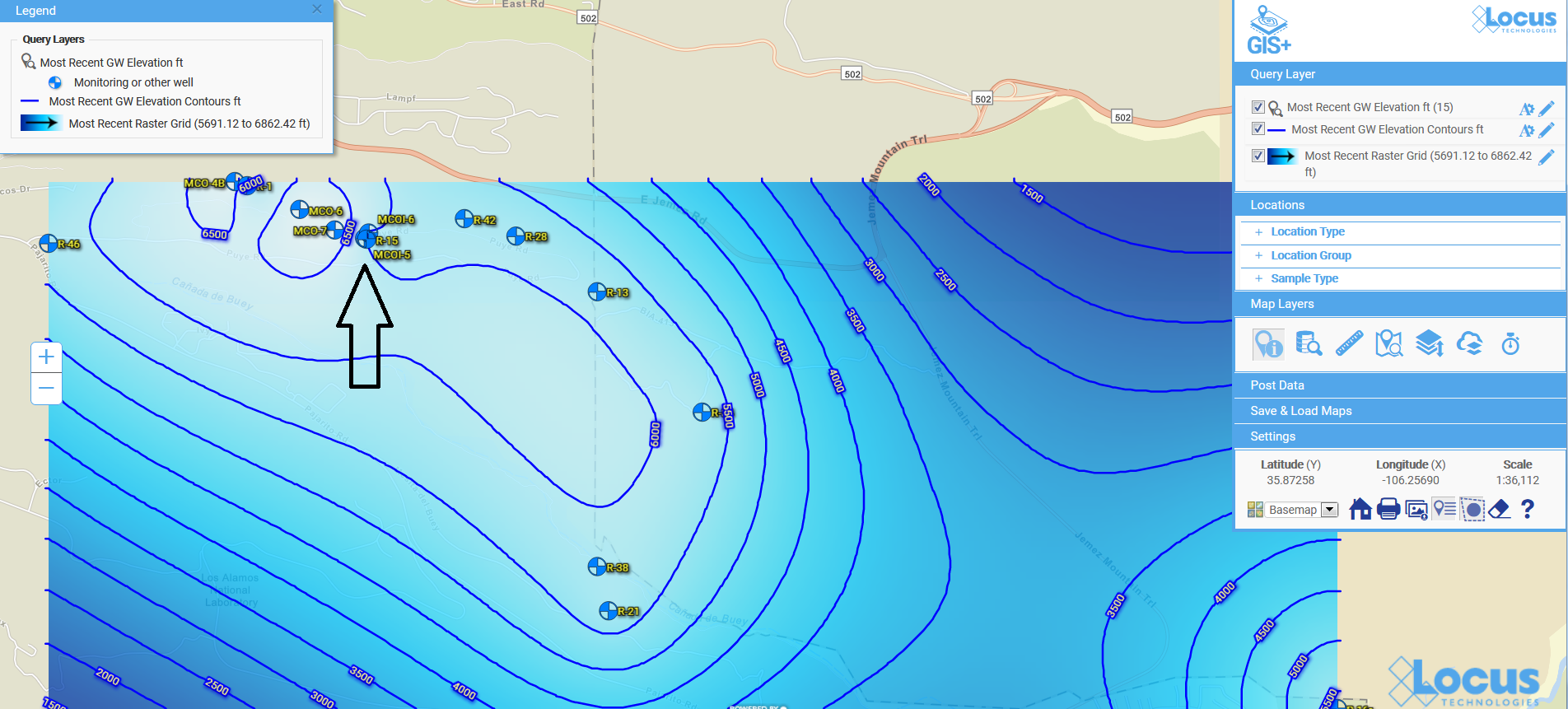
Figure 8 Contour map for groundwater levels
The contour map completes our tour of some of the visualization tools in EIM. Because visualizations let you chunk items together, you can look at the ‘big picture” and not get lost in tables of data results. Your working memory stays within its capacity, your analysis of the information becomes more efficient, and you can gain new insights into your data.
Acknowledgments: All the data in EIM used in the examples was obtained from the publicly available chemical datasets online at Intellus New Mexico.
[sc_button link=”https://www.locustec.com/applications/environmental-information-management/” text=”Learn more about Locus EIM” link_target=”_self” color=”#ffffff” background_color=”#52a6ea” centered=”1″]
[sc_image width=”150″ height=”150″ src=”16303″ style=”11″ position=”centered” disable_lightbox=”1″ alt=”Dr. Todd Pierce”]
About the Author—Dr. Todd Pierce, Locus Technologies
Dr. Pierce manages a team of programmers tasked with development and implementation of Locus’ EIM application, which lets users manage their environmental data in the cloud using Software-as-a-Service technology. Dr. Pierce is also directly responsible for research and development of Locus’ GIS (geographic information systems) and visualization tools for mapping analytical and subsurface data. Dr. Pierce earned his GIS Professional (GISP) certification in 2010.
Tag Archive for: Groundwater
Locus Technologies Unveils Expansion of its Water SaaS to Produced Water Management for the Oil and Gas Industry
SAN FRANCISCO, Calif., Jan. 16, 2024 — Locus Technologies, (Locus), the pioneer in water, Environmental, Health, and Safety (EHS) compliance and Environmental, Social, and Governance (ESG) software solutions, announces expansion of its water management SaaS platform to include management of produced water within the oil and gas industry. This cutting-edge solution, seamlessly integrated with Locus’ suite of applications, underscores the company’s unwavering commitment to driving sustainable practices while optimizing operational efficiency.
Locus has engineered a comprehensive application designed specifically for the efficient and sustainable management of produced water. This latest addition to Locus’s suite of water solutions aims to address the complex demands of the oil and gas industry while ensuring compliance, conservation, and operational excellence.
The new application is seamlessly interoperable with other Locus solutions catering to the oil and gas sector, such as ESG, air emissions, waste management, and water quality management. Locus software empowers organizations to make informed decisions, mitigate risks, and enhance overall efficiency across their operations by streamlining data integration and providing actionable insights.
Locus’ CEO, Neno Duplan, emphasized the company’s dedication to delivering comprehensive water management solutions while driving advancements in technology for the beneficial reuse of water beyond the realms of the oil and gas, and energy industries. “We remain focused on delivering comprehensive water management solutions to our customers while advancing technologies for the beneficial reuse of water inside and outside of the oil and gas industry, which holds the promise of further improving the sustainability of our customer’s operations,” stated Duplan.
With a proven track record in providing leading-edge EHS and ESG software solutions, Locus continues to spearhead advancements in compliance, sustainability, and corporate responsibility across diverse industries and geographies.
About Locus Technologies
Locus Technologies, the global environmental, social, governance (ESG), Sustainability, and EHS Compliance software leader, empowers companies of every size and industry to be credible with ESG reporting. From 1997 Locus Technologies pioneered enterprise software-as-a-service (SaaS) for EHS Compliance, water management, and ESG credible reporting. Locus apps and software solutions improve business performance by strengthening risk management and EHS for organizations across industries and government agencies. Organizations ranging from medium-sized businesses to Fortune 500 enterprises, such as Chevron, Sempra, Corteva, DuPont, Chemours, San Jose Water Company, The Port Authority of New York and New Jersey, Port of Seattle, Onto Innovations, and Los Alamos National Laboratory, have selected Locus.
Locus Technologies’ headquarters is in Mountain View, California.
For further information regarding Locus Technologies and its commitment to excellence in SaaS solutions, please visit www.locustec.com or email info@locustec.com.
San Jose Water Expands Locus Technologies SaaS to include GIS+
Locus GIS+ will streamline SJW’s water quality and environmental management from watershed to consumer taps.
MOUNTAIN VIEW, Calif., 14 February 2023 — Locus Technologies, the leading EHS Compliance, and ESG software provider, today announced that San Jose Water (SJW), an investor-owned public utility providing water service to a population of approximately one million people in the Santa Clara Valley, has expanded Locus’ environmental information management software to use Locus GIS+ for advanced GIS analysis.
SJW has been using Locus SaaS and mobile app since 2014 to manage its field data collection, water quality compliance, and regulatory reporting. SJW also uses Locus to track sewer discharges and well blow-offs.
“Our responsibility is to ensure our customers receive the highest quality drinking water from their taps. We monitor the quality and cleanliness of our water in terms of state and federal regulatory requirements. In 2021, our highly experienced staff collected more than 1,000 regulatory and non-regulatory samples from our distribution system and treatment plant, generating over 23,000 data points. To manage this data effectively, we used Locus’ cloud-based software. GIS mapping capabilities are essential for our environmental data analysis. Locus GIS+ will allow quick data visualization and is a quantum leap forward with advanced analysis tools that use Esri’s Smart Mapping technology,” said Suzanne DeLorenzo, the Director of Water Quality at San Jose Water.
“Locus’s mission is to help organizations, such as San Jose Water, to achieve their business goals by providing them the software tools to manage key data associated with water quality and compliance reporting,” said Neno Duplan, CEO of Locus. “With GIS+, SJW will have all the tools they need to perform a wide range of geospatial data analysis across their distribution system. Our water quality management cloud-based software, coupled with GIS+ and Locus Mobile for field data collection, provides our customers with a highly scalable and feature-rich application that gives water utilities strong analytical power and advanced GIS capabilities.”
Locus GIS+ is powered by Esri’s ArcGIS platform and offers various advanced features— including enhanced cartography, comprehensive spatial data analysis, and the ability to use the customer’s map data through integration with ArcGIS Online and Portal for ArcGIS.
ABOUT SAN JOSE WATER
Founded in 1866, San Jose Water is an investor-owned public utility and is one of the largest and most technically sophisticated urban water systems in the United States. Serving over one million people in the greater San Jose metropolitan area, San Jose Water also provides services to other utilities, including operations and maintenance, billing, and backflow testing. San Jose Water is owned by SJW Group, a publicly-traded company listed on the New York Stock Exchange under the symbol SJW. SJW Group also owns Connecticut Water Company in Connecticut; Maine Water Company in Maine; and SJWTX, Inc. (dba Canyon Lake Water Service Company) in Texas. To learn more about San Jose Water, visit www.sjwater.com.