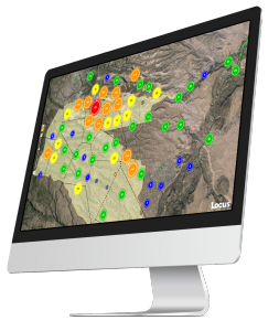
A Visualization is Worth a Thousand Data Points
Visualize environmental data with Locus EIM.
You’ve probably heard the saying “A picture is worth a thousand words”. While the advice seems timeless, it actually is fairly modern and started with newspaper advertisements from the 1910s. Furthermore, it’s only since the 1970s that cognitive science has caught up and determined the truth in the saying. Basically, humans have very limited working memory, which is the “storage space” for processing data while making decisions and reasoning through problems. A good picture, though, works as “offline storage” that lets you push information out of your limited working memory and into another format for use as needed. This advantage is especially true when the picture is a useful data visualization such as a chart or map. In this case, you could say “A visualization is worth a thousand data points”.
How limited is working memory? There is a rough consensus, known as Miller’s law, that you can only have “seven, plus or minus two” items in memory at one time. Think of a typical 10-digit phone number that you may need to memorize for a short period. It can be hard to remember all ten individual digits as one large number, as that exceeds working memory. However, you can employ a technique called “chunking” to group items together, reducing the number of items to remember. If you group the phone numbers into the typical ###-###-#### pattern, you only have to remember 3 chunks of 3 to 4 items. A good visualization not only stores information offline, reducing pressure on your brain; it also groups many data items into a much smaller number of chunks so you can process the data more efficiently.
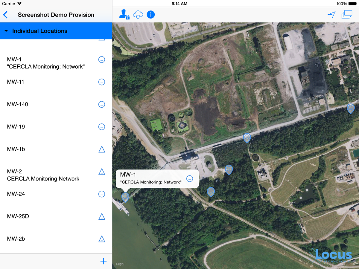
Let’s look at some real examples of how visualizations help by working through a typical scenario using EIM, Locus Technologies’ cloud-based application for environmental data management. Assume you manage a site where you are tracking tritium (H-3) levels in groundwater using a set of monitoring wells. You want to know where tritium has been high over the past ten years. EIM provides different visualizations for exploring your data and finding the answers you need.
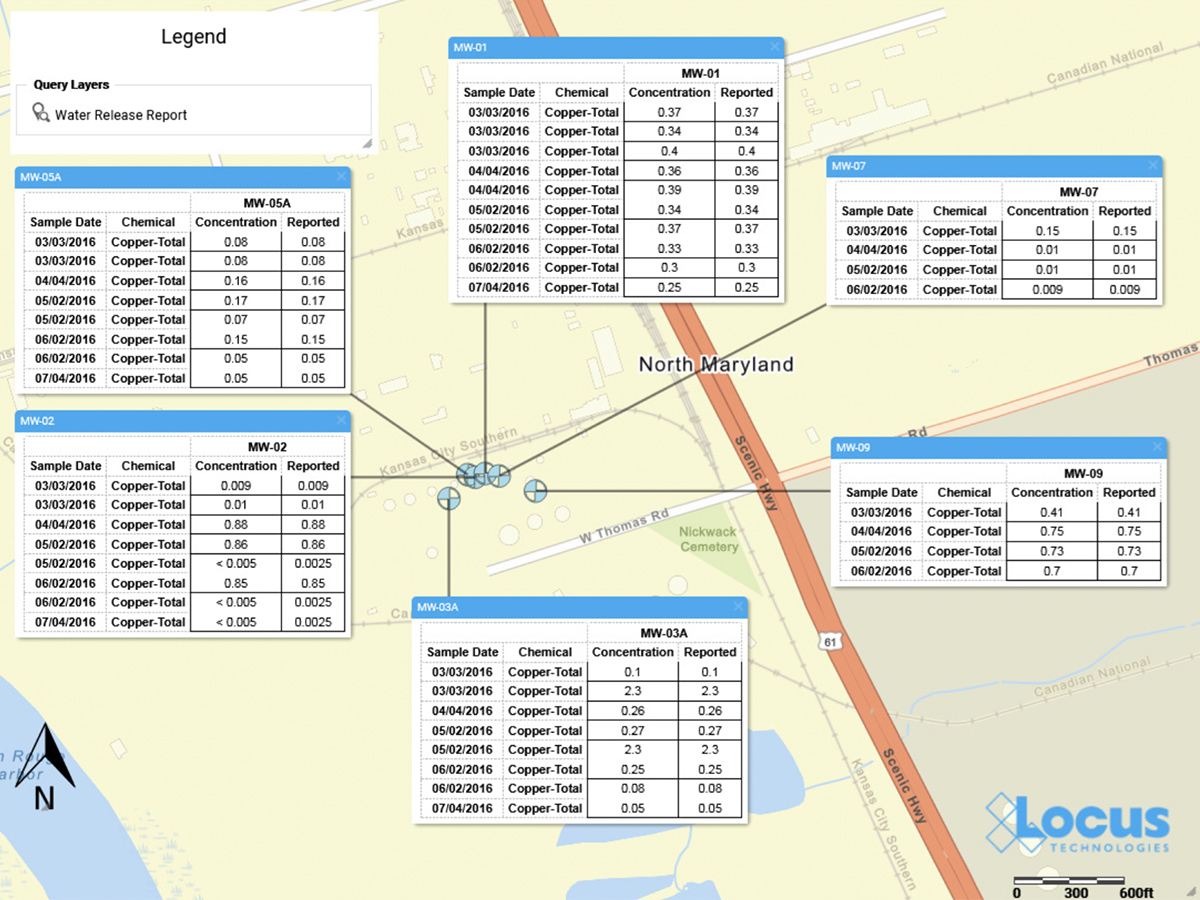
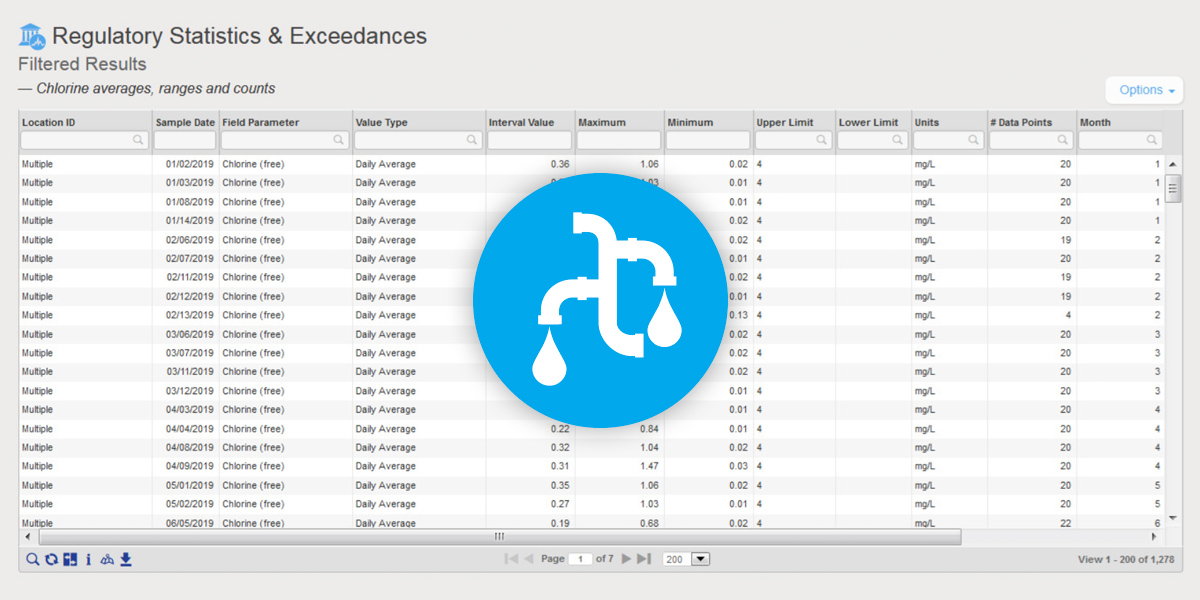
First let’s just look at an export of all the data. Using the analysis functions in EIM, you search for all tritium concentrations from monitoring wells for the past ten years. EIM sends the results to a table as shown in Figure 1.
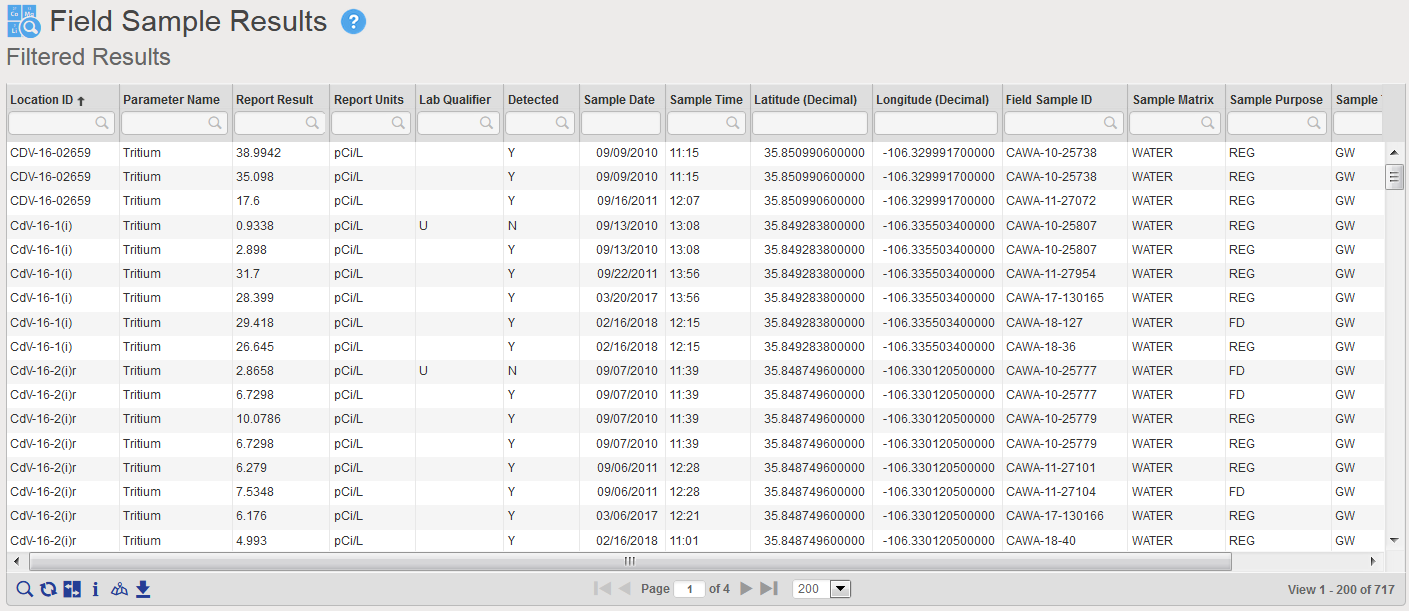
Figure 1 Tabular view of Tritium query results
The table has 717 results for multiple wells. It is very difficult to see overall patterns here, either spatially or temporally. Each of the 717 results is one item, and if you try to scroll and sort the table to see if tritium is increasing or decreasing over time, your working memory is quickly overwhelmed. This is where a good data visualization can help.
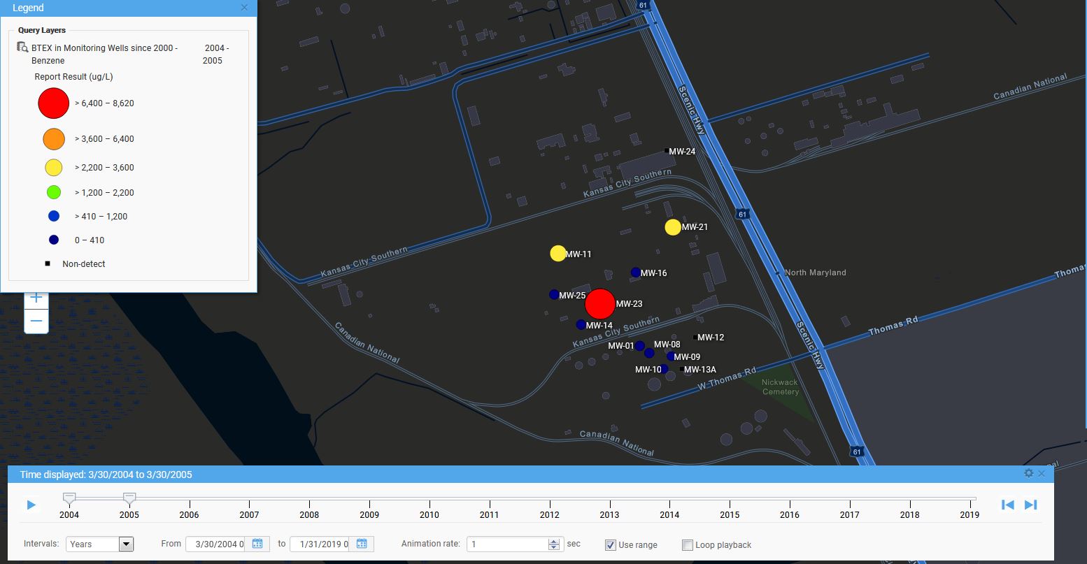
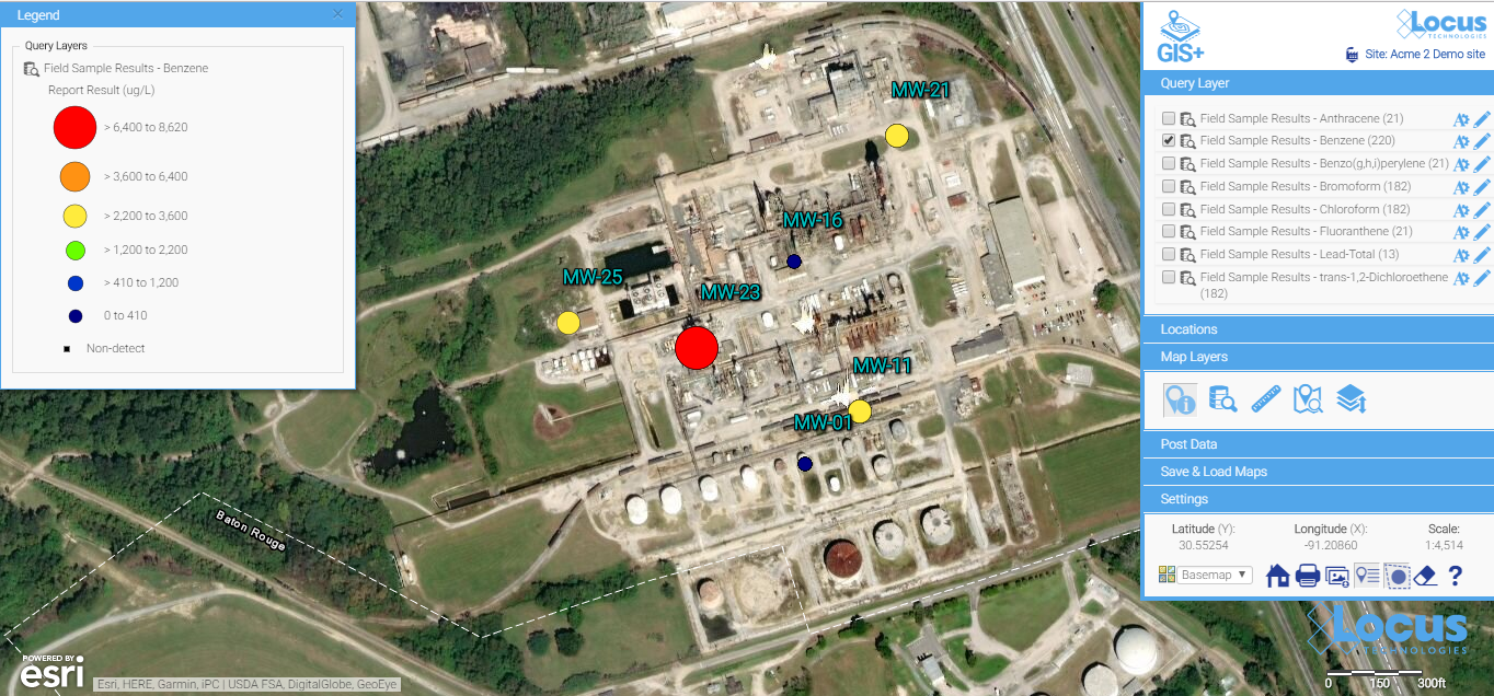
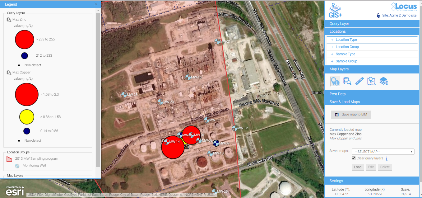
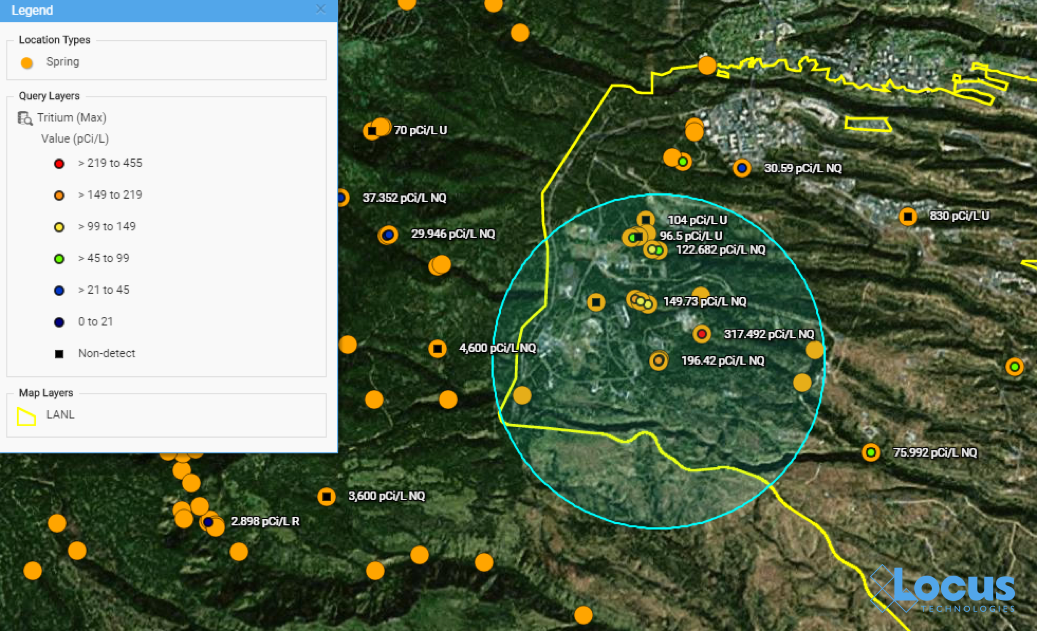
To start, you decide to send the data to the Locus GIS+ application, using the graduated color and size options. The GIS+ takes the concentrations from the results table and plots them on a site map using the stored coordinates for each well, as shown in Figure 2. The map represents each location with a symbol that is colored and sized to reflect the actual maximum value at that location. The map legend shows you how this was done. Large red circles, for example, represent results from 4,500 to 7,000 pCi/L. As the sizes get smaller, and the colors go from red to blue, the actual result gets smaller.
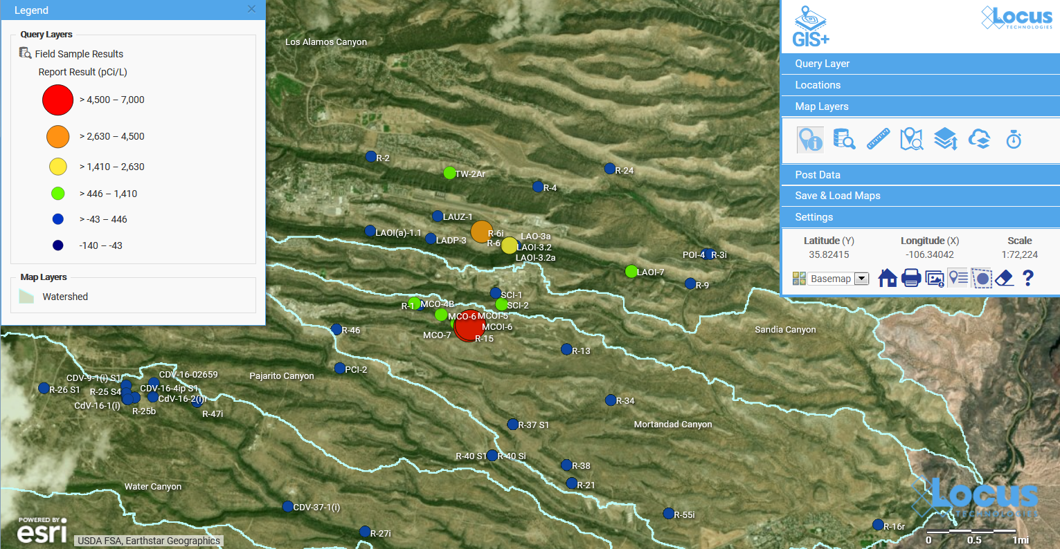
Figure 2 Graduated symbol and color map of tritium concentrations
This map is great for showing spatial patterns in the data. You can easily pick out a couple of “areas of concern” near the center of the map – one with orange and yellow circles, and another with red circles. To revisit our discussion on working memory and chunks, the map takes the 717 results and summarizes them so your brain can quickly pick out the two areas of concern.
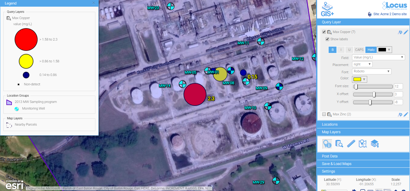
Let’s look more closely at the area of concern with higher results. If we zoom in on the map, we see the two red locations are wells MCOI-5 and MCOI-6 as shown in Figure 2.
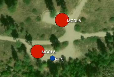
Figure 3 Zoomed map for one area of concern
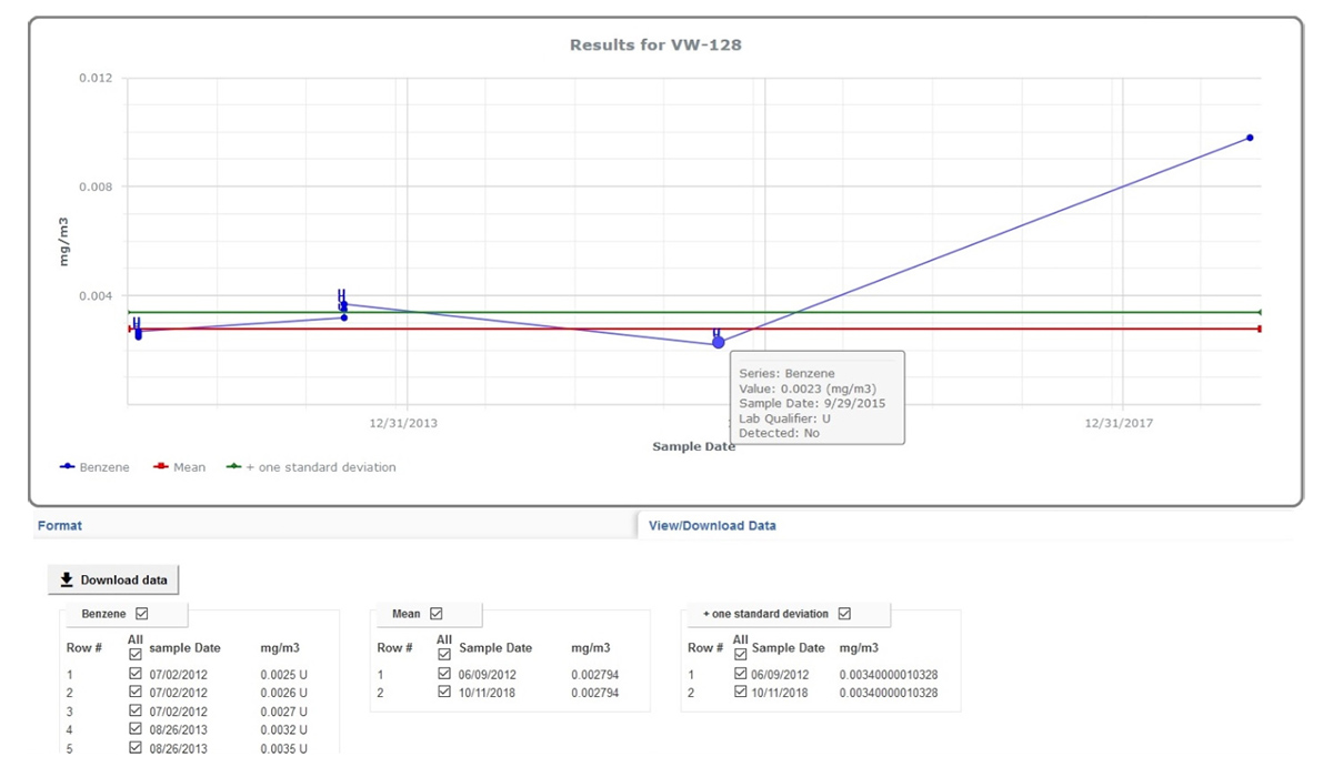
The map shows you where these two high concentrations of tritium are located. But what if you want to see how the concentrations vary over time? You can make a time series chart in EIM for these wells and include a desired regulatory limit, as shown in Figure 4. The green and blue lines represent the tritium concentrations over time for the two wells. The red line at top shows a regulatory action limit.
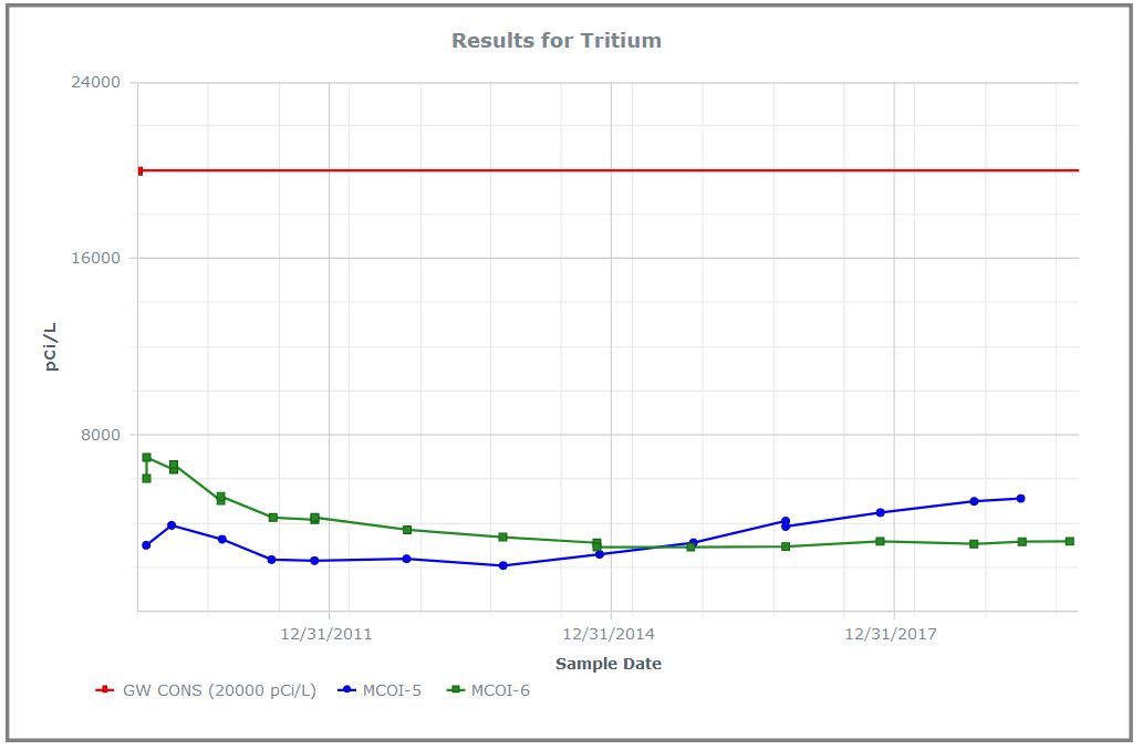
Figure 4 Line chart showing time series for tritium for two wells, with action limit
The chart shows you two important things. First, and most importantly, all the tritium concentrations for both wells lie well below the regulatory action limit! Second, the concentrations have very different trends for the two wells: MCOI-6 started higher but has trended lower, while MCOI-5 started below MCOI-6 but has now surpassed it. You can confirm these general impressions by running concentration regression charts in EIM for the two locations, as shown in Figure 5. The charts show the best fit regression line and the strength of the relation.
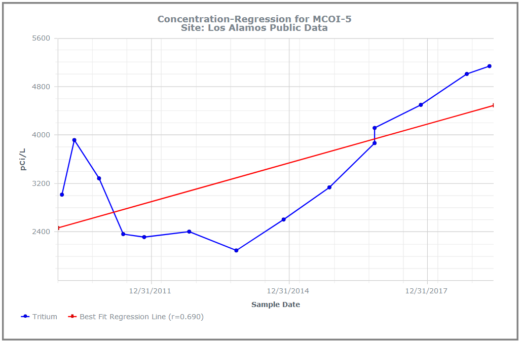
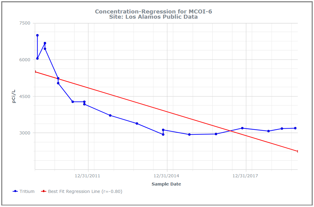
Figure 5 Concentration regression charts in EIM
You can grasp these facts quickly because the of how the chart works. Each series of concentrations for a well consists of multiple data items that are ‘chunked’ into one line on the chart. There are two many individual data points on this chart for your working memory, but only three lines, which can easily be manipulated in your brain. For comparison, Figure 6 shows the actual data values for the chart. The time trends shown above in the charts are not as obvious from the table.
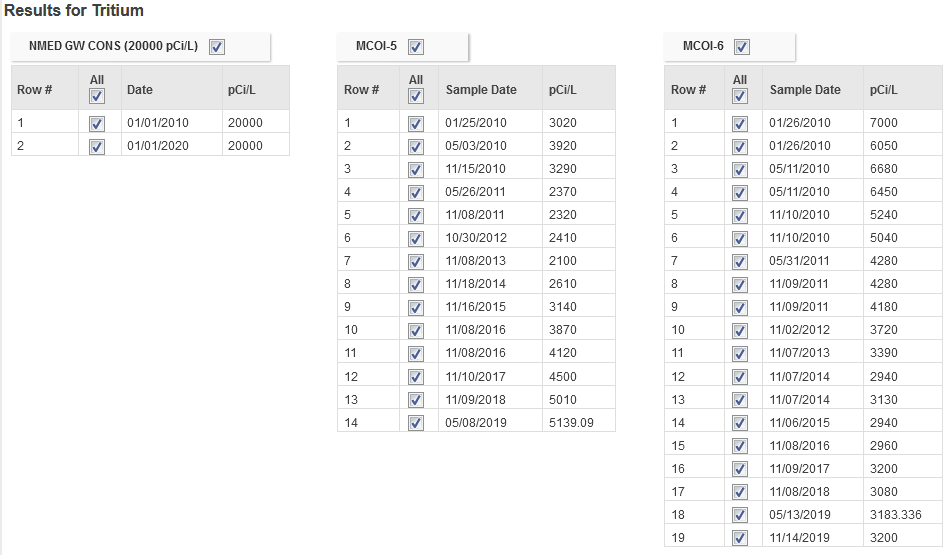
Figure 6 Actual data values for the chart in Figure 4
Now, this might be counter-intuitive, but what if you wanted to put some of these values on the map? While visualizations do help understand data, sometimes it can be useful to have the data shown as well so viewers can see where the visualizations came from. The EIM Data Callouts function can do this. Figure 7 shows data callouts for the two wells. Each callout shows the maximum annual tritium result for 2010-2020. Now you have the actual tritium concentrations located spatially next to the matching wells!
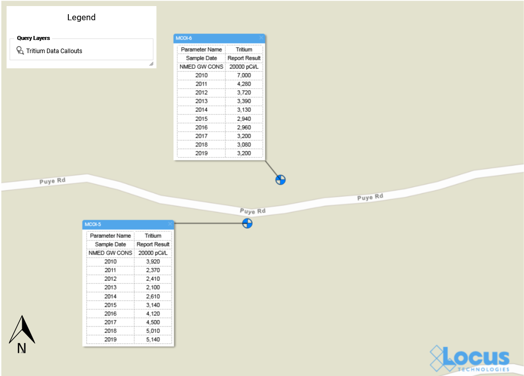
Figure 7 Data Callouts in EIM GIS+
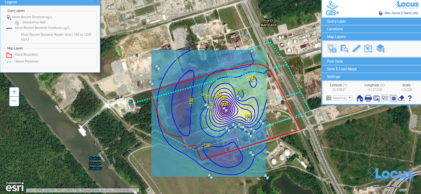
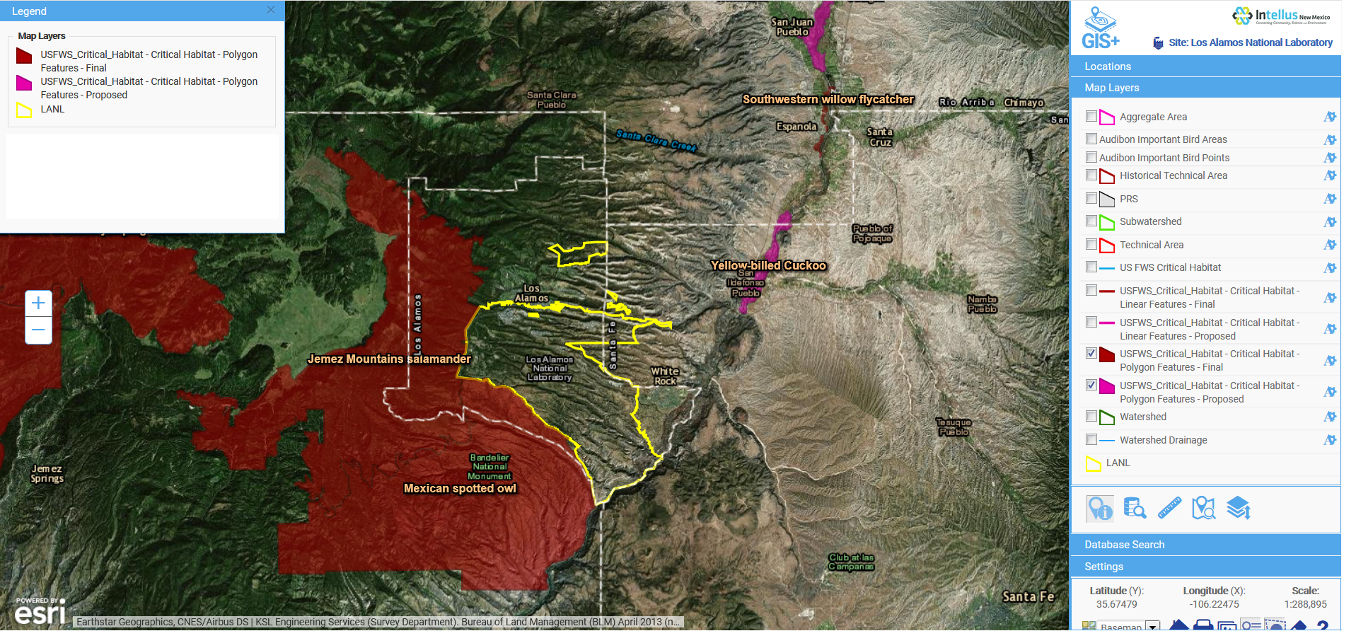
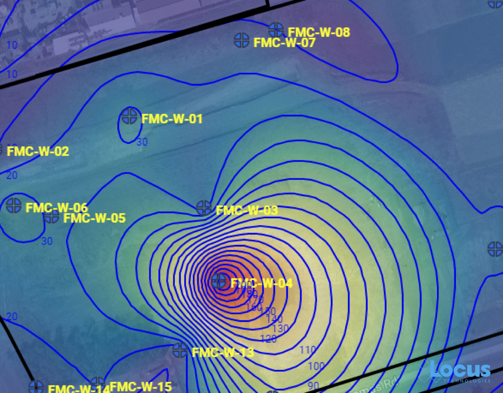
Now that you know where your tritium might be a concern, suppose you want to see what’s going on with groundwater at your site. The EIM contouring module does that for you. There are multiple contouring options, but for this example let’s use the default options for kriging. We know from Figure 2 that the wells MCOI-5 and MCOI-6 are located in the Mortandad Canyon. Figure 8 shows the contouring map generated from EIM for the groundwater wells in that canyon, using the most recent groundwater levels. Higher groundwater values are lighter in color than lower values.
The area of concern is marked with an arrow at upper left. The contour lines and values can help you determine how the tritium might migrate in your site. Imagine trying to picture this just using tables of groundwater readings! With the contour map, the readings turn into lines that can be chunked together for analysis: the higher levels at the upper left forming a “plateau”, the closely packed lines moving across the map to the east, and then the “saddle” area at lower right. These different line patterns carry particular meanings to engineers and scientists who interpret contour maps.
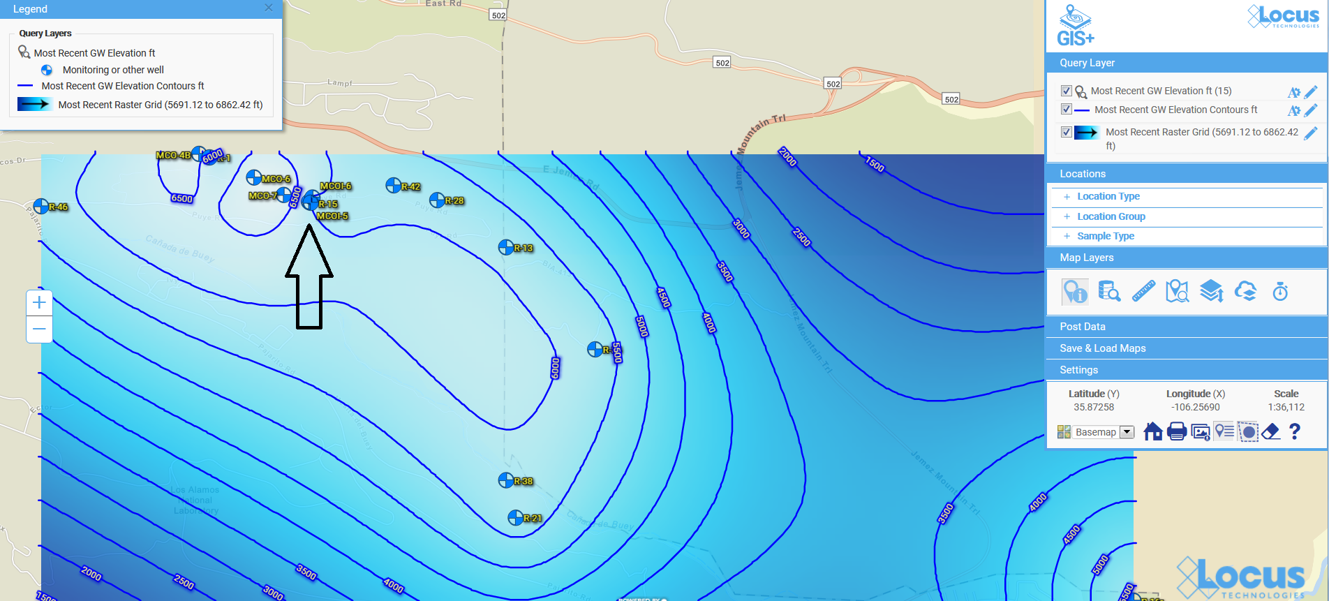
Figure 8 Contour map for groundwater levels
The contour map completes our tour of some of the visualization tools in EIM. Because visualizations let you chunk items together, you can look at the ‘big picture” and not get lost in tables of data results. Your working memory stays within its capacity, your analysis of the information becomes more efficient, and you can gain new insights into your data.
Acknowledgments: All the data in EIM used in the examples was obtained from the publicly available chemical datasets online at Intellus New Mexico.
About the Author—Dr. Todd Pierce, Locus Technologies
Dr. Pierce manages a team of programmers tasked with development and implementation of Locus’ EIM application, which lets users manage their environmental data in the cloud using Software-as-a-Service technology. Dr. Pierce is also directly responsible for research and development of Locus’ GIS (geographic information systems) and visualization tools for mapping analytical and subsurface data. Dr. Pierce earned his GIS Professional (GISP) certification in 2010.

 See your data in new ways with Locus GIS for environmental management.
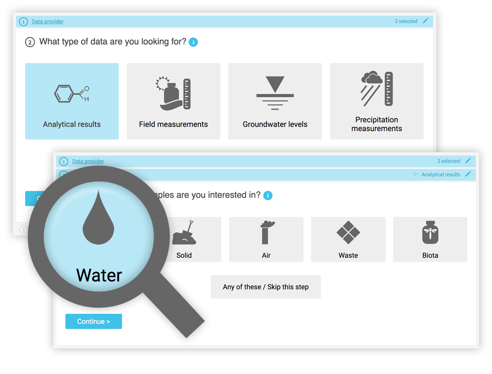 While a knowledgeable environmental scientist may be able to easily navigate a highly technical system, that same operation is bound to be far more difficult for a layperson interested in what chemicals are in their water. Constructing the right query is not as simple as looking for a chemical in water—it really matters what type of water you want to look within. On the Intellus website (showing the environmental data from the LANL site), there are 16 different types of water (not including “water levels”). Using the latest web technologies and our domain expertise, Locus created a much easier way to get to the data of interest.
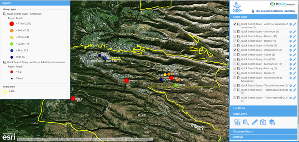


 About guest blogger— Dr. Todd Pierce, Locus Technologies