Simplify your EPA fenceline regulatory reporting
Locus handles all the EPA required environmental data collected at your refinery giving you a simple solution for all your data management and reporting needs.
Locus handles all the EPA required environmental data collected at your refinery giving you a simple solution for all your data management and reporting needs.
Mobile tools for EHS have been around for some time now. By now, most users are familiar with the benefits such as instant data collection and access to reference information for better, more reliable EHS programs. However, as any tech-savvy individual knows, new software tools are consistently becoming more powerful and more accessible, and that is certainly true for mobile applications. That “ground-breaking” EHS mobile app that you purchased five years ago may now be looking a little dated if your software provider has not actively updated it. Here are some of the beyond-the-basic features that you probably really want, but perhaps never knew existed for your EHS mobile app.
Your coordinates are actively being recorded every time your phone moves. Why not record that data as part of an incident report or sample collection? Or use that information to locate the position of a monitoring well or other asset? Much of EHS information is associated to a specific location, so automatically storing your location can help ensure that you know where your data are originating.
You may be thinking that phone/tablet GPS is not very accurate, and you would be correct…..for now. According to GPS.gov, phone accuracy is typically accurate to within a 4.9 m (16 ft.) radius under open sky. While this may be accurate enough for some situations, it will not be sufficient for others. However, according to the IEEE, a respected technical engineering association, 2018 and beyond will bring new more accurate chips to phones that will improve GPS accuracy to about 30 centimeters, which should be much more useful for field locations especially when identifying the scene of a spill or accident.
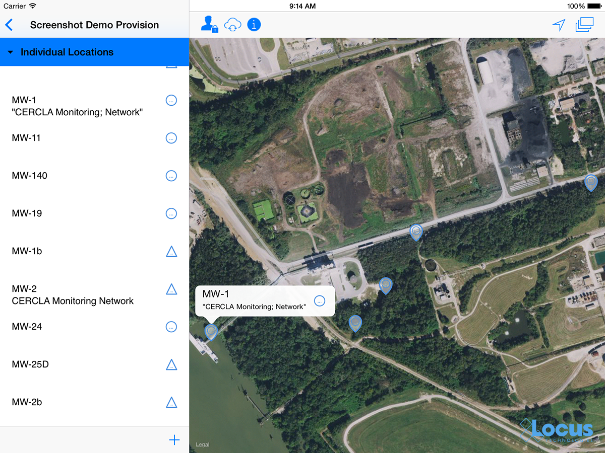
So start thinking about what can be improved with your business process by getting more accurate location information, and start looking at upgrading mobile devices in the next year or two.
You are probably already using your phone to compare prices at your local store. It is amazingly easy to simply scan a product’s barcode and instantly see the best available price locally or online. Since virtually every phone/tablet now has a built-in camera, you can use that to scan barcodes or QR codes to associate data entry with a tagged location or asset. This can save you from possible mismatch errors that can occur when simply selecting from a list or typing in data.
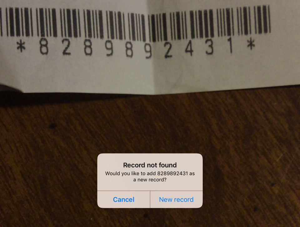
For users with thousands of locations/assets, it’s also a huge time saver when you can skip the long list of locations and just point and click. Moreover, for anyone tracking assets or even chemical inventory, barcodes are essential. In fact, many facilities have been using barcodes for years, but now they don’t need a specialized device. Barcodes or QR codes can be incorporated into mobile apps in new and unexpected ways to streamline business process and do more in the field with less physical overhead.
Therefore, the next time you are doing an audit, you can easily examine an instrument and immediately determine its calibration and maintenance status along with reporting any audit findings.
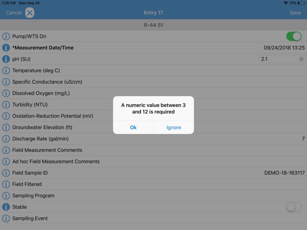
It is not enough to just enter your EHS event information into a mobile device. You also want to make sure you are entering correct information. Modern EHS mobile tools can check your entry as you enter it, to match whatever criteria are established for that data. So you make sure that you’re entering a pH reading of 7.2, rather than 72. You can also use configurable pick lists to limit data entry to your specific desired entries and not have to deal with misspellings or 16 different ways to say “cloudy”. Make sure that pick lists are configurable and can be shared with each of your company’s devices.
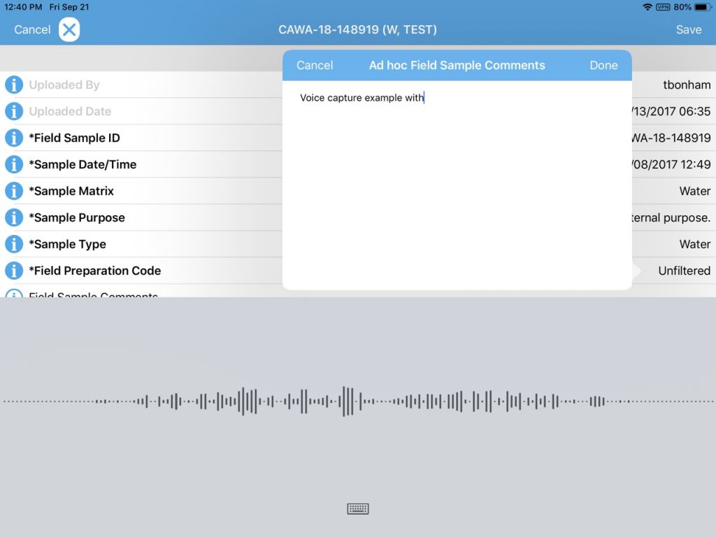
We are starting to use voice recognition technology in our mobile devices to quickly send out text messages. Why not use it for recording audit comments or field issues? Voice recognition is getting better and better every year, and can get your comments onto a data collection form much faster than typing and can be especially useful for conditions where gloves are required and typing or stylus input is not practical. Using the phone’s native abilities, take advantage of voice feature to streamline note taking knowing you can always fix up any issues back in the office.
For many EHS programs, you may have your own data collection needs that are specific to your facility or industry. Mobile EHS apps now allow you to tailor your input forms to add new data fields, remove unwanted fields, change some of the logic like making certain fields required, and make certain fields tied into established pick lists. Even better, you can match the mobile form exactly to the original paper form, making the transition to mobile simple and intuitive for staff.
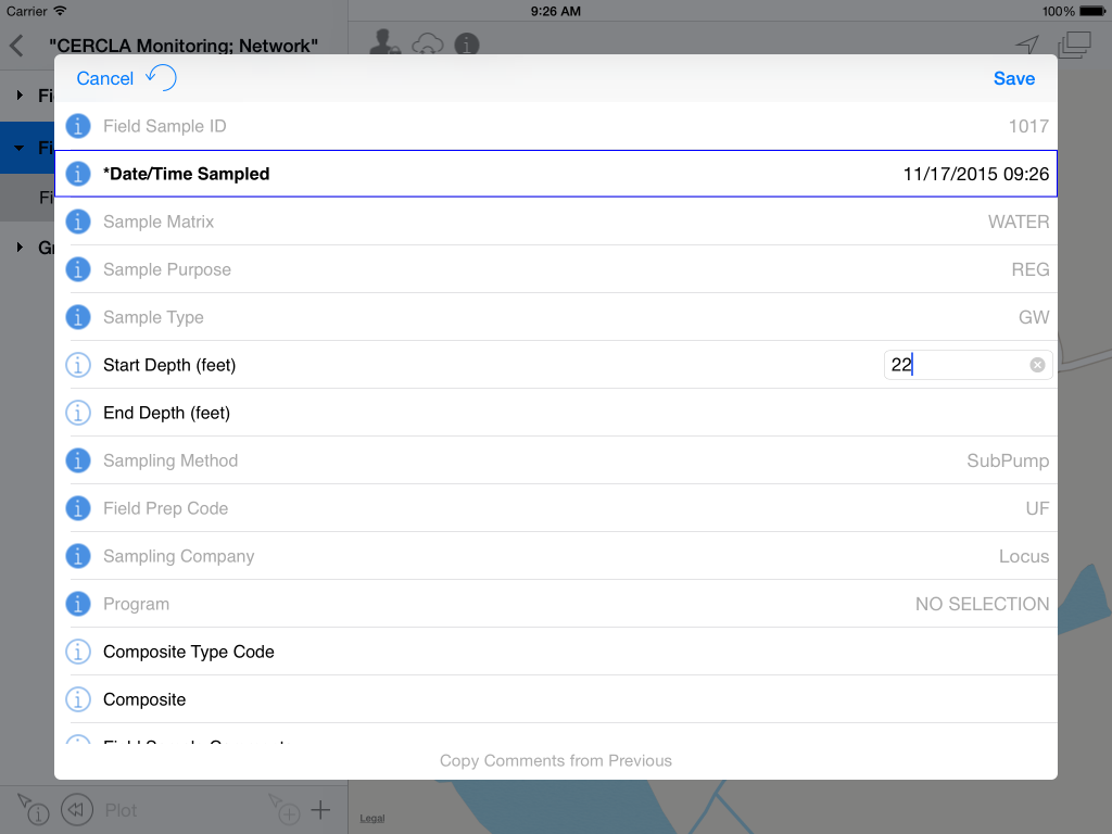
Along with form customization options, modern mobile apps let you have many different forms in one app, so the folks tracking waste shipments have their form, while to folks performing facility audits have their forms, which may be specific to the facility of the audit itself. One app with many forms greatly streamlines the training aspect of deploying mobile and gives EHS managers great flexibility to easily update forms when regulations change. Learn more.
In our last GIS blog, we covered some tips for choosing an integrated GIS/environmental data management system. Now let’s look at some more advanced features that may be appealing to a wide range of data managers and facility owners.
You can turbocharge your water data management by including a geographical information system (GIS) in your toolkit! Your data analysis efficiency also gets a huge boost if your data management system includes a GIS system “out of the box” because you won’t have to manually transfer data to your GIS. All your data is seamlessly available in both systems.
Not all GIS packages are created equal, though. Here are some tips to consider when looking at mapping applications for your environmental data:
Mapping is easy when properly integrated with your environmental database. You should not need extra filters or add-on programs to visualize your data. Look for built-in availability of features, such as “click to map”, that take the guesswork and frustration out of mapping for meaningful results.
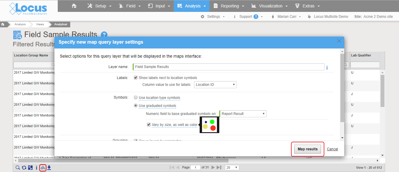
Good integration means mapping is as easy as clicking a “show on map” button. In Locus EIM, you can run a data query and click “Show results on map” icon, change the default settings if desired, and instantly launch a detailed map with a range of query layers to review all chemicals at the locations of interest.
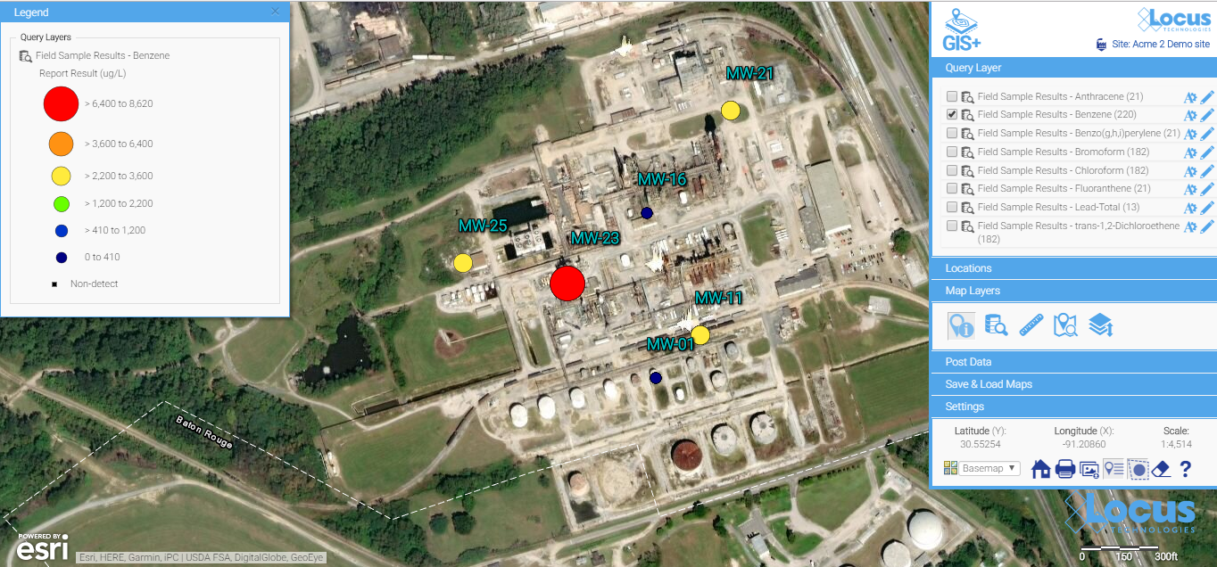
All the query results are presented as query layers, so you can review the results in detail. This map was created with the easy “show results on map” functionality, which anyone can use with no training.
Look for easy editing tools to change the label colors, sizes, fonts, positioning, and symbols. Some map backgrounds make the default label styles hard to read and diminish the utility of the map, or if you’re displaying a large quantity of data, you’ll almost certainly need to tweak some display options to make these labels more readable.
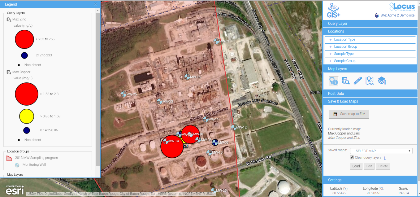
Default label styles are legible on this background, but they are a bit hard to read.
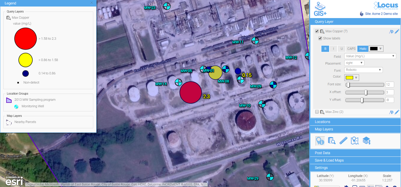
A few simple updates to the font color, font sizes, label offset, and background color make for much easier reading. Changes are made via easy-to-use menus and are instantly updated on the map, so you have total control to make a perfectly labeled map.
Contours can be a great way to visually interpret the movement of contaminants in groundwater and is a powerful visualization tool. In the example below, you can clearly see the direction the plume is heading and the source of the problem. An integrated GIS with a contouring engine lets you go straight from a data query to a contour map—without export to external contouring or mapping packages. This is great for quick assessments for your project team.
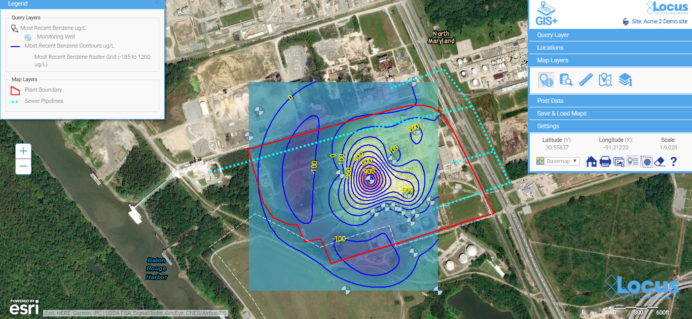
Contour maps make it easy to visualize the source and extent of the plumes. They can be easily created with environmental database management systems that include basic contouring functionality.
Many companies use sophisticated and expensive mapping software for their needs. But the people running those systems are highly trained and often don’t have easy access to your environmental data. For routine data review and analysis, simple is better. Save the expensive, stand-alone GIS for wall-sized maps and complex regulatory reports.
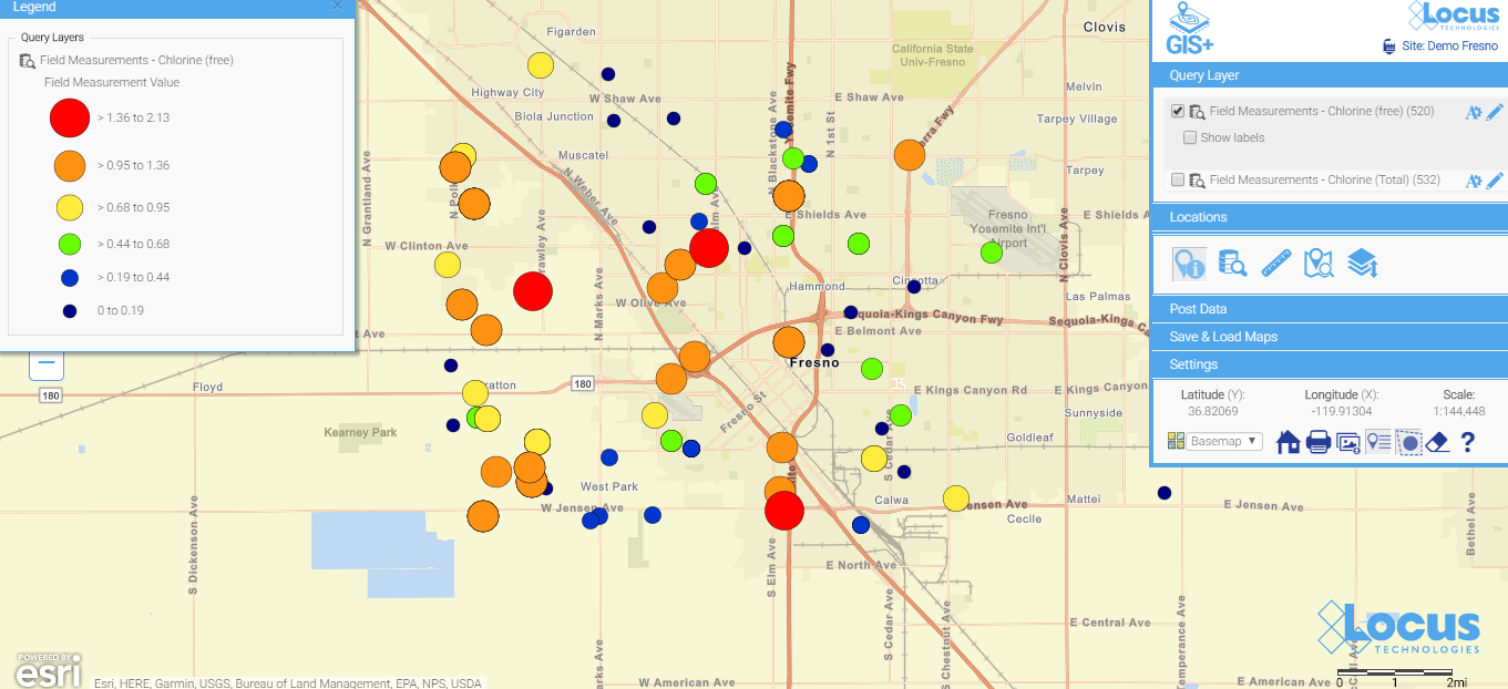
Here is a simple map (which is saved, so anyone can run it) showing today’s chlorine data in a water distribution system. You don’t have to wait for the GIS department to create a map when you use a GIS that’s integrated with your environmental database system. When data are updated daily from field readings, these maps can be incredibly helpful for operational personnel.
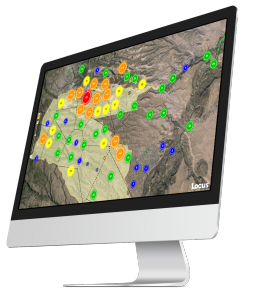 See your data in new ways with Locus GIS for environmental management.
Taking the next steps
After viewing some of the many visualization possibilities in this blog, the next step is make some maps happen!
Happy mapping!
MOUNTAIN VIEW, Calif., 19 June 2018 — Locus Technologies (Locus), the industry leader in multi-tenant SaaS EHS and environmental management software, is pleased to announce that Hudbay Minerals, a premier mining company in Canada, will use Locus EIM to improve their environmental data management for field and analytical data reporting. In addition to the standard features of Locus EIM, Hudbay Minerals is opting to use Locus’ GIS+ mapping solution, Locus Mobile for iOS, and the robust LocusDocs document management solution to enhance and streamline their processes.
Locus EIM and the integrated GIS+ solution will help Hudbay Minerals to improve efficiency of sampling and monitoring activities for both field and analytical data. The SaaS solution is enhanced by Locus Mobile for field data collection, which works offline without any internet connection.
“The Hudbay team in Arizona looks forward to working with the Locus team and using the system,” said Andre Lauzon, Vice President, Arizona Business Unit at Hudbay.
“By using the powerful smart mapping technology of Locus GIS+, powered by Esri and integrated with all the functionalities of Locus EIM, Hudbay Minerals can save data queries as map layers to create more impactful visual reports,” said Wes Hawthorne, president of Locus Technologies.
At the annual WM Symposia, representatives from many different DOE sites and contractors gather once a year and discuss cross-cutting technologies and approaches for managing the legacy waste from the DOE complex. This year, Locus’ customer Los Alamos National Laboratory (LANL) was the featured laboratory. During their presentation, they discussed Locus GIS+, which powers Intellus, their public-facing environmental monitoring database website.
If you haven’t been to LANL’s Intellus website recently, you are in for a surprise! It was recently updated to better support casual users, and it features some of the best new tools Locus has to offer. Locus reimagined the basic query engine and created a new “Quick search” to streamline data retrieval for casual users. The guided “Quick search” simplifies data queries by stepping you through the filter selections for data sources, locations, dates, and parameters, providing context support at each step along the way.
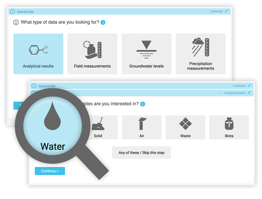 While a knowledgeable environmental scientist may be able to easily navigate a highly technical system, that same operation is bound to be far more difficult for a layperson interested in what chemicals are in their water. Constructing the right query is not as simple as looking for a chemical in water—it really matters what type of water you want to look within. On the Intellus website (showing the environmental data from the LANL site), there are 16 different types of water (not including “water levels”). Using the latest web technologies and our domain expertise, Locus created a much easier way to get to the data of interest.
Just querying data is not necessarily the most intuitive activity to gain insights. Locus integrated our new GIS+ visualization engine to allow users to instantly see all the data they just queried in detailed, context-rich maps.
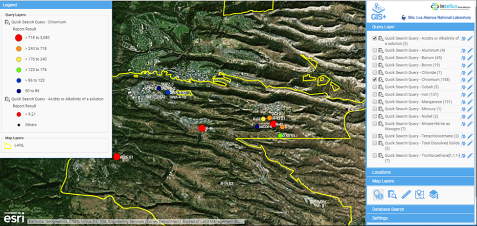
Intellus GIS+ map showing “Quick search” query results for chromium levels in the LANL area
Instead of a dense data grid, GIS+ gives users an instant visual representation of the issue, enabling them to quickly spot the source of the chemicals and review the data in the context of the environmental locations and site activities. Most importantly for Intellus users, this type of detailed map requires no GIS expertise and is automatically created based on your query. This directly supports Intellus’ mission to provide transparency into LANL’s environmental monitoring and sampling activities.
GIS+ also allows users (albeit with a bit more experience in GIS mapping) to integrate maps from a wide range of online sources to provide even more insight to the available data. In the example below, we overlaid the publicly-available US Fish and Wildlife critical habitat maps with data from the LANL site to show the relationship of the site to critical habitats. This type of sophisticated analysis is the future of online GIS. Locus takes full advantage of these opportunities to visualize and integrate data from varying sources with our GIS+ tools, made simple for users and integrated with ArcGIS Online by Esri.
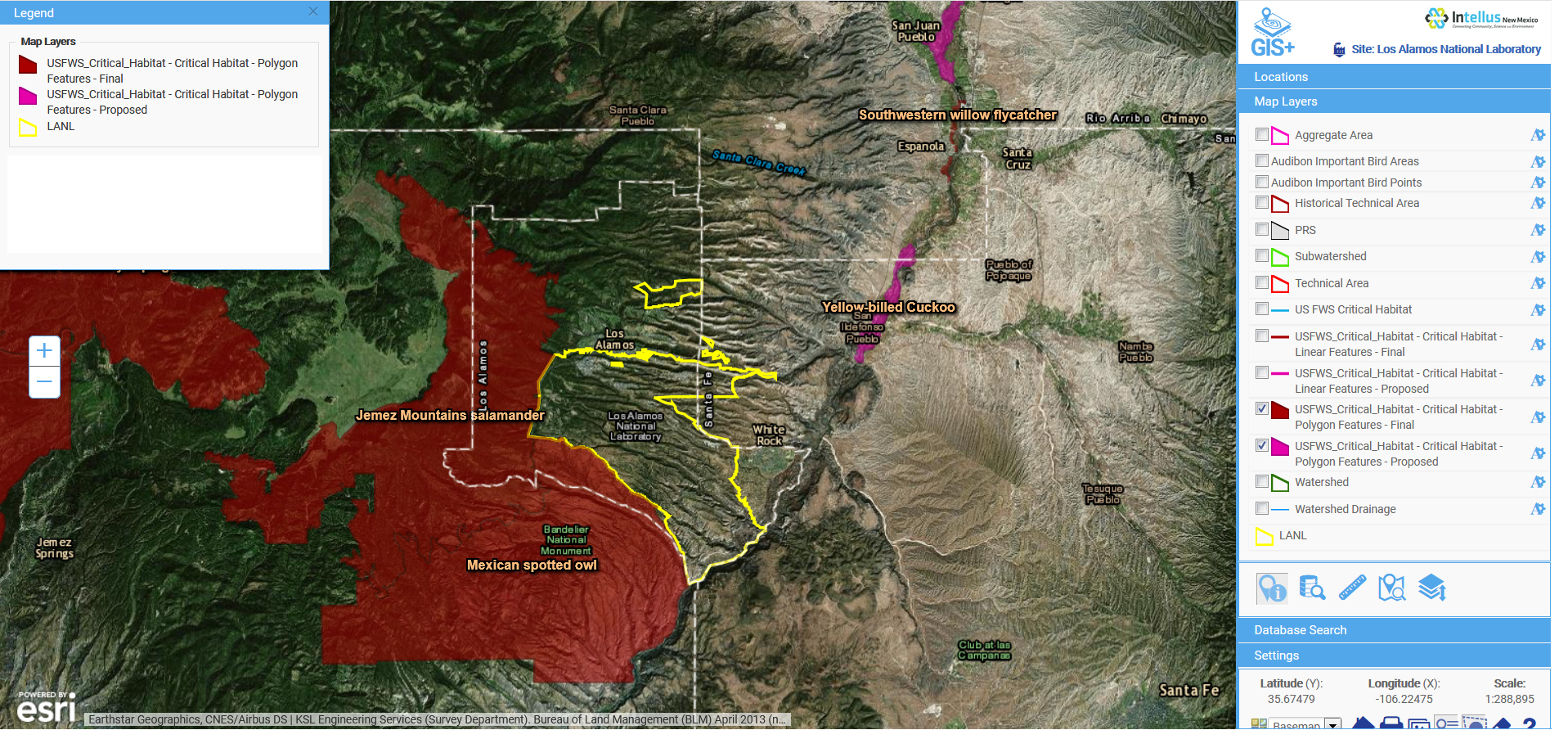
Intellus GIS+ map showing imported layers of US Fish and Wildlife critical habitats in relation to LANL environmental sampling data

Overall, Locus is very proud of our cross-cutting environmental information management tools. We were one of many WM18 attendees enjoying LANL’s presentation and getting even more ideas from the audience on the next steps for better environmental visualization.
US EPA fenceline monitoring data collection officially begins on January 30, 2018. We have put together an infographic to show you some of the ways Locus EIM can help you streamline, consolidate, and take control of all your important environmental information using maps, data reports, formatted outputs, charts, and more!
Click image for larger version
GIS Day was established in 1999 to showcase the power and flexibility of geographical information systems (GIS). In celebration of the 55th birthday of GIS, we’ve compiled a brief history of the evolution of this powerful technology, with a special focus on how it can be used in EHS applications to make environmental management easier.
Not only is GIS more powerful than ever before—it is also vastly more accessible. Anyone with Internet access can create custom maps based on publicly available data, from real-time traffic conditions to environmental risk factors, to local shark sightings. Software developers, even those at small companies or startups, now have access to APIs for integrating advanced GIS tools and functionality into their programs.
Before you can understand where GIS is today, it helps to know how it started out. This year is the 55th anniversary of the work done by Roger Tomlinson in 1962 with the Canada Land Inventory. We consider this the birth of GIS, and Mr. Tomlinson has been called the “father of GIS”.
The original GIS used computers and digitalization to “unlock” the data in paper maps, making it possible to combine data from multiple maps and perform spatial analyses. For example, in the image shown here from the Canada Land Inventory GIS, farms in Ontario are classified by revenue to map farm performance.
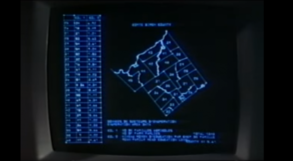
An early GIS system from the Canada Land Inventory, in Data for Decisions, 1967
Photo: Mbfleming. “Data for Decisions (1967).” YouTube, 12 Aug. 2007, https://youtu.be/ryWcq7Dv4jE.
Part 1, Part 2, Part 3
In 1969, Jack Dangermond founded Esri, which became the maker of, arguably, the world’s most popular commercial GIS software. Esri’s first commercial GIS, ARC/INFO, was released in 1982, and the simpler ArcView program followed in 1991. Many of today’s most skilled GIS software developers can trace their roots back to this original GIS software.
Back then, GIS work required expensive software packages installed on personal computers or large mainframe systems. There was no Google Maps; all map data had to be manually loaded into your software. Getting useful data into a GIS usually required extensive file manipulation and expertise in coordinate systems, projections, and geodesy.
While the government, utility, and resource management sectors used GIS heavily, there was not much consumer or personal use of GIS. Early GIS professionals spent much of their time digitizing paper maps by hand or trying to figure out why the map data loaded into a GIS was not lining up properly with an aerial photo. This may sound familiar to those who have been in the environmental industry for awhile.
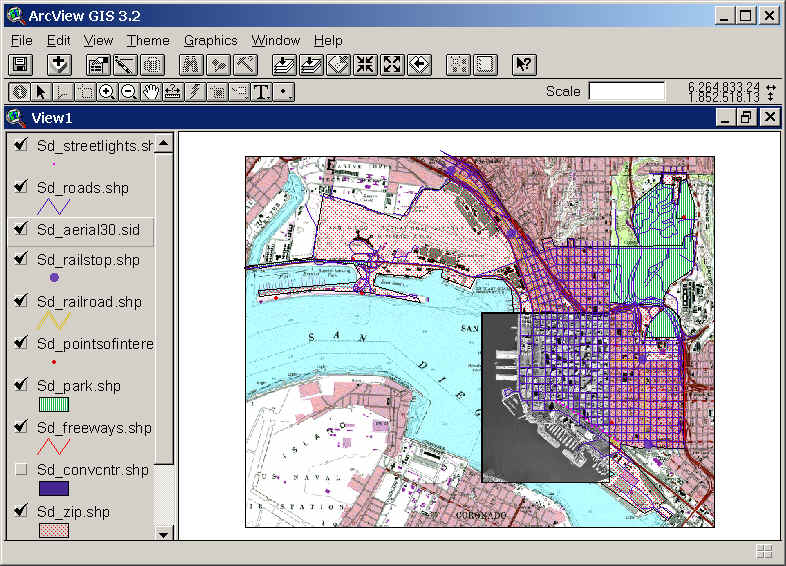
Esri’s ArcView 3.2 for desktop computers (from the 1990s)
https://map.sdsu.edu/geog583/lecture/Unit-3.htm
How much has changed since those early days! After the release of OpenStreetMap in 2004, Google Maps and Google Earth in 2005, and Google Street View in 2007, GIS has been on an unstoppable journey—from only being used by dedicated GIS professionals on large computers in specific workplaces, to be accessible to anyone with an internet browser or a smartphone. High-quality map data and images—often the most expensive item in a GIS project in the 1990’s — are now practically free.
Just think how revolutionary it is that anyone can have instant access to detailed satellite images and road maps of almost anywhere on Earth! Not only can you perform such mundane tasks as finding the fastest route between two cities or locating your favorite coffee shop while on vacation—you can also see live traffic conditions for cities across the globe; view aerial images of countries you have never visited; track waste drums around your facility; and get street level views of exotic places. Back in 1991, such widespread access to free map data would have seemed like something straight out of science fiction.
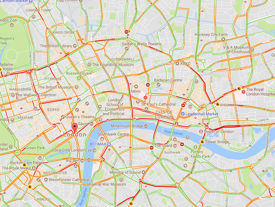
Traffic conditions in London, 3:30 pm 10/16/2017, from Google Maps

South Base Camp, Mount Everest, Google StreetView
Obviously, the amount of spatial data needed to provide detailed coverage of the entire globe is far too large to be stored on one laptop or phone. Instead, the data is distributed across many servers “in the cloud.” Back in the 1990s, everything for one GIS system (data, processing engine, user interface) needed to be in the same physical place—usually one hard drive or server. Now, thanks to the internet and cloud computing, the data can be separate from the software, creating “distributed” GIS.
The combination of freely available data with distributed GIS and the power of smart phones has led us to the age of “neogeography”—in which anyone (with some technical knowledge) can contribute to online maps, or host their maps with data relevant to their personal or professional needs. GIS no longer requires expensive software or cartographical expertise; now, even casual users can create maps linking multiple data sources, all in the cloud.
Google’s MyMaps is an example of a tool for easily making your maps. Maps can range from the playful, such as locations of “Pokemon nests,” to the serious, such as wildfire conditions.
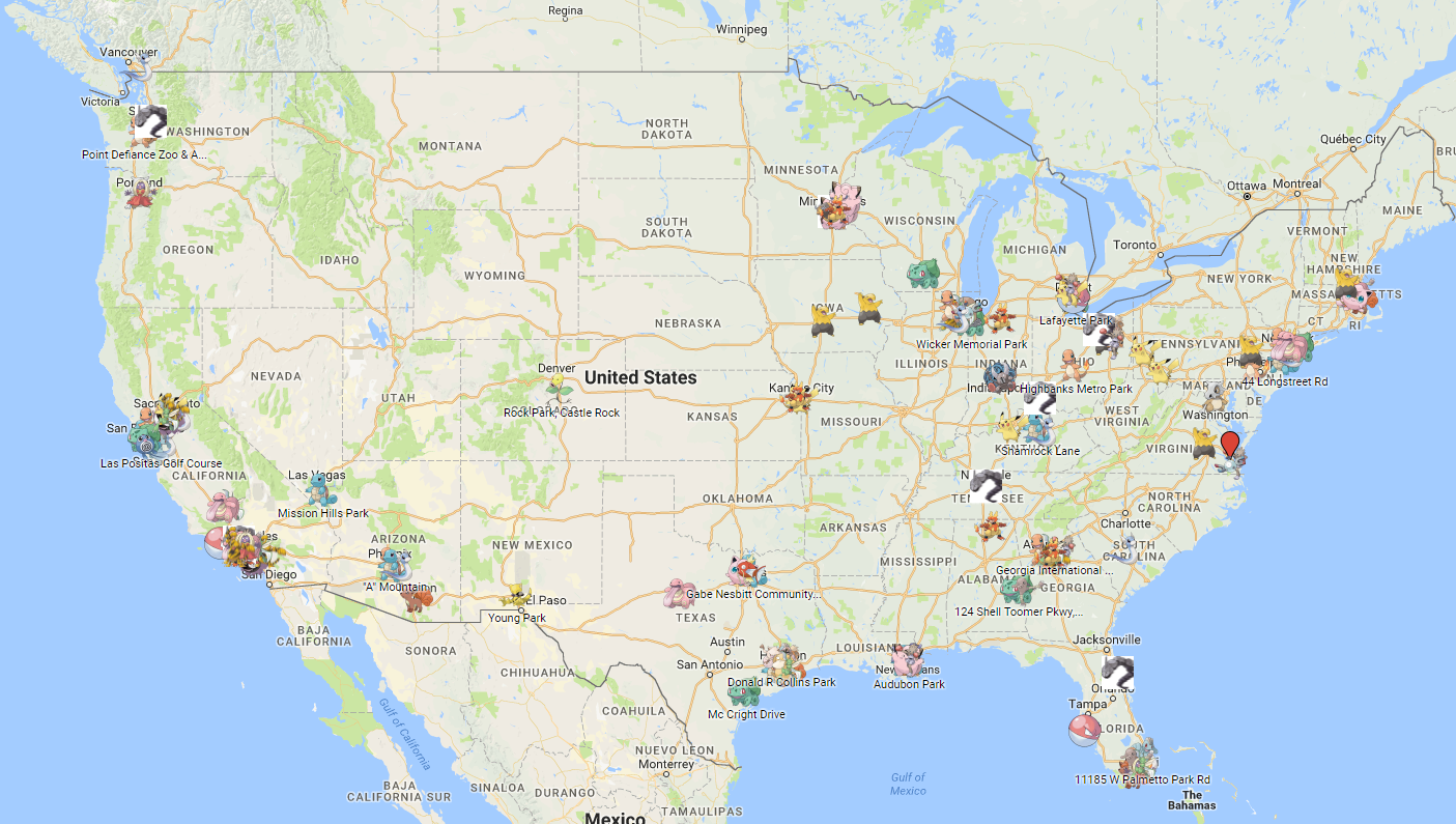
Google MyMaps of Pokemon Nest Locations
https://www.google.com/maps/d/viewer?mid=1anyDs-H7hOtGQaxaTwuLjulUrVM&hl=en&usp=sharing
These online maps can be updated in real time (unlike paper maps) and therefore kept current with actual conditions. Such immediate response is instrumental in emergency management, where conditions can change rapidly, and both first responders and the public need access to the latest data.
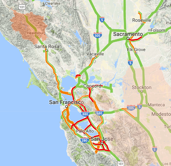
Map showing wildfire and traffic conditions in northern California, 10/16/2017
https://google.org/crisismap/us-wildfires
Furthermore, software programmers have created online GIS tools that let non-coders create their maps. These tools push the boundaries of distributed GIS even further by putting the processing engine in the cloud with the data. Only the user interface runs locally for a given user. During this period of GIS history, it became easy to create “mashups” for viewing different types of disparate data at once, such as natural hazard risks near offices, pizza stores near one’s neighborhood, EPA Superfund sites near one’s home, property lines, flood plains, landslide vulnerability, and wildfire risk.
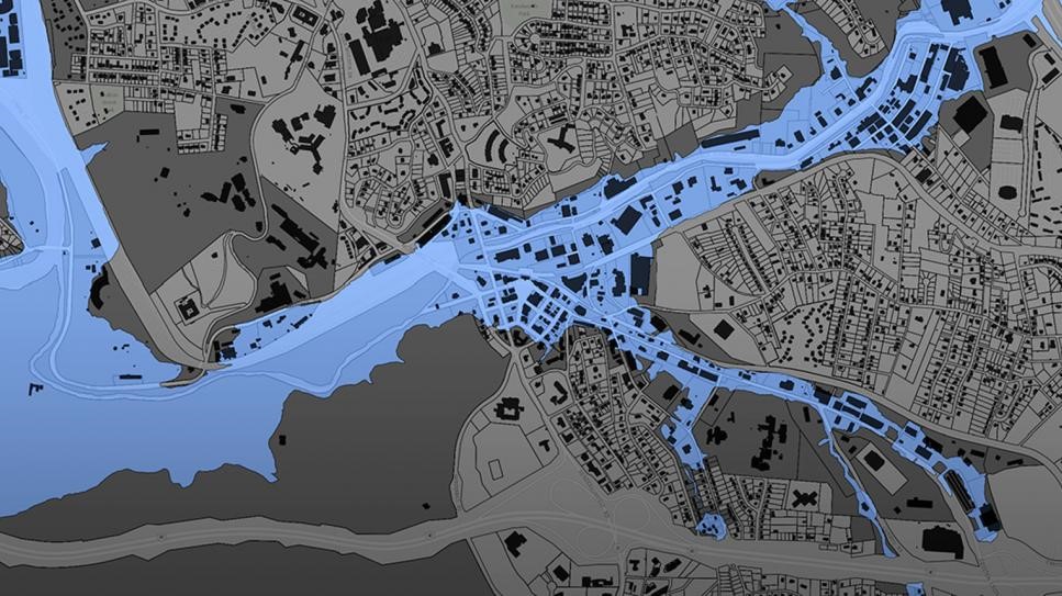
Floodplain data for Buncombe County, NC
https://buncombe-risk-tool.nemac.org
Another significant advance in GIS technology is the ability to integrate or include advanced GIS tools and features in other computer programs. Companies such as Google and Esri have provided toolkits (called APIs, or application programming interfaces) that let coders access GIS data and functions inside their programs. While neogeography shows the power of personal maps created by the untrained public, computer programmers can use APIs to create some very sophisticated online GIS tools aimed at specific professionals or the public.
One example is the publicly-available Intellus application that Locus Technologies developed and hosts for the US Department of Energy’s Los Alamos National Laboratory. It uses an Esri API and distributed GIS to provide access to aerial images and many decades of environmental monitoring data for the Los Alamos, NM area. Users can make maps showing chemical concentrations near their home or workplace, and they can perform powerful spatial searches (e.g., “find all samples taken within one mile of my house in the last year”). The results can be color-coded based on concentration values to identify “hot spots”.
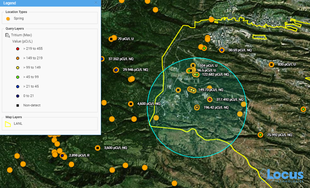
Map from Intellus showing Tritium concentrations near a specified location
https://www.intellusnmdata.com
Another example of more sophisticated forms of analysis is integration of GIS with environmental databases. Many government facilities and private vendors incorporate GIS with online data systems to let public users evaluate all types of information they find relevant.
For example, contour lines can be generated on a map showing constant values of groundwater elevation, which is useful for determining water flow below ground. With such powerful spatial tools in the cloud, any facility manager or scientist can easily create and share maps that provide insight into data trends and patterns at their site.
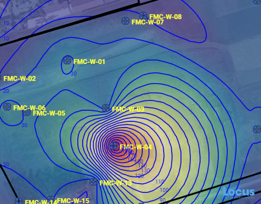
Groundwater contour map where each line is a 10 ft. interval, from the Locus EIM system
Other examples include monitoring air emissions at monitoring sites (like US EPA’s AirData Air Quality Monitors, shown below) and actual stream conditions from the USGS (also shown below).
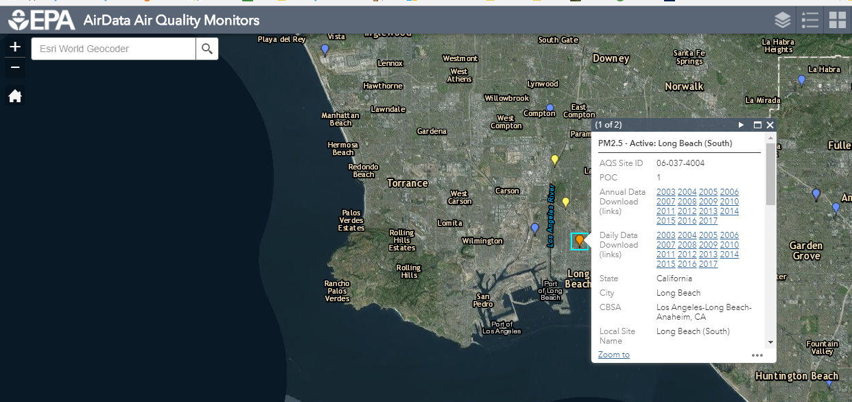
Screenshot from US EPA AirData Air Quality Monitors interactive GIS mapping platform, showing Long Beach, California
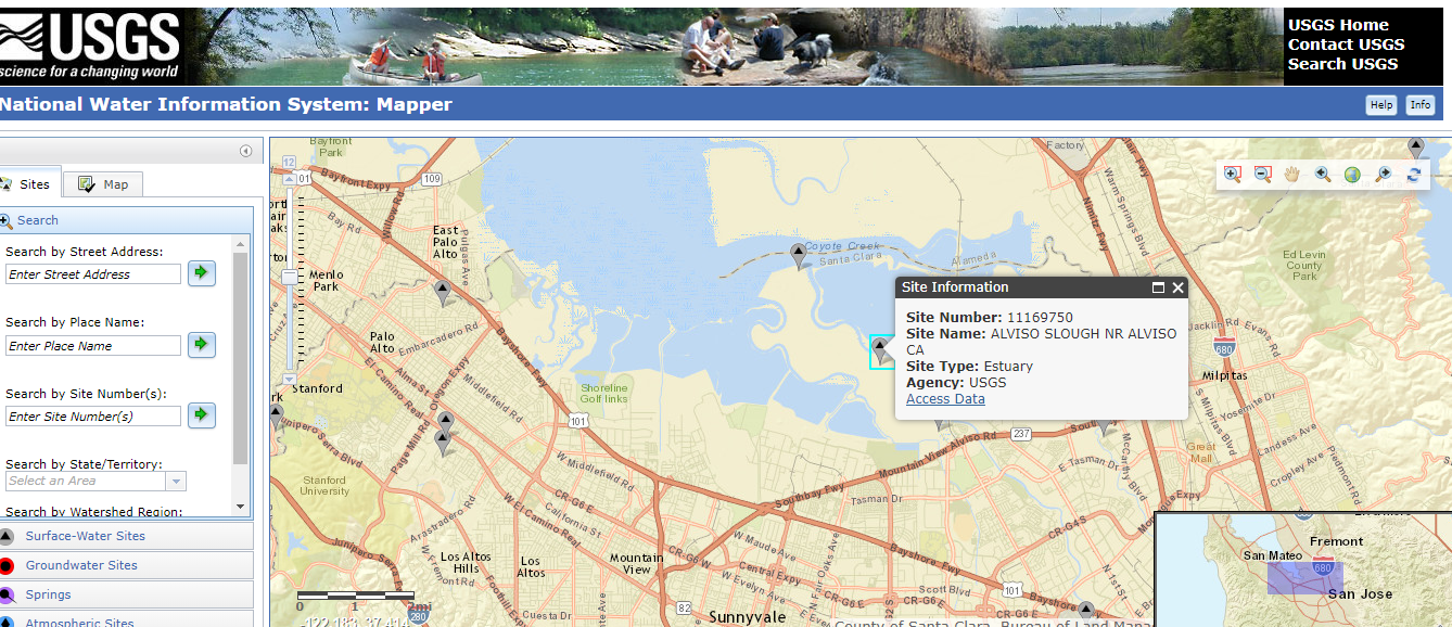
Screen capture of USGS National Water Information System interactive GIS map tool, showing a site in Mountain View, California
One particularly exciting aspect of GIS today is the ability to use GIS on a smartphone or tablet. The GIS APIs mentioned above usually have versions for mobile devices, as well as for browsers. Programmers have taken advantage of these mobile APIs, along with freely available map data from the cloud, to create apps that seamlessly embed maps into the user experience. By using a smartphone’s ability to pinpoint your current latitude and longitude, these apps can create personalized maps based on your actual location.
A search in the Apple AppStore for “map” returns thousands of apps with map components. Some of these apps put maps front-and-center for traditional navigation, whether by car (Waze, MapQuest, Google), public transit (New York Subway MTA Map, London Tube Map), or on foot (Runkeeper, Map My Run, AllTrails). Other apps use maps in a supporting role to allow users to find nearby places; for example, banking apps usually have a map to show branches near your current location.
What’s really exciting are the apps that allow users to enter data themselves via a map interface. For example, HealthMap’s Outbreaks Near Me not only shows reports of disease outbreaks near your location, but it also lets you enter unreported incidents. The GasBuddy app shows the latest gasoline prices and lets you enter in current prices. This “crowdsourcing” feature keeps an app up-to-date by letting its users update the map with the latest conditions as they are happening.
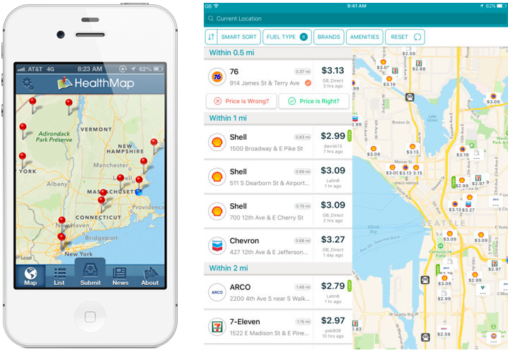
The Outbreaks Near Me app for phones (left) and the GasBuddy app for tablets (right)
EHS professionals can further harness the power of GIS using mobile applications. For example, in the Locus Mobile app for field data collection, users can enter environmental data—such as temperature or pH measurements—from a sampling location, then upload the data back to cloud-based environmental management software for immediate review and analysis. Mobile apps can also support facility compliance audits, track current locations of hazardous waste drums, collect on-scene incident data (complete with photos), and record exact locations for mapping by colleagues back in the office.
GIS-enabled mobile apps also typically include a map interface for navigating to data collection points and tracking visited locations. Other key features to look for include ad hoc location creation for capturing unplanned data—this lets users create new data collection points “on the fly” simply by clicking on the map.
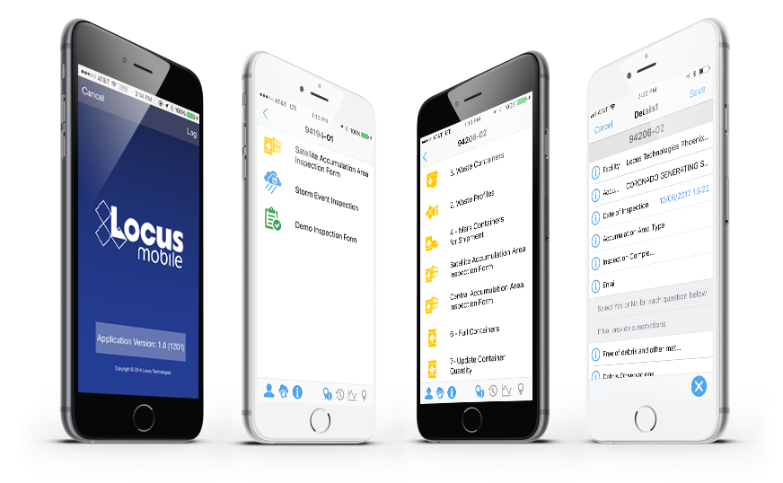
Views of many different mobile app use cases from tracking drums to collecting field data
Where will GIS as a whole go from here? It’s possible that augmented reality, virtual reality, and 3D visualization will continue to expand and become as ubiquitous as the current “2D” maps on browsers and phones. Also, the “internet of things” will surely have a GIS component because every physical “thing” can be tied to a geographical location. Similarly, GIS can play an important role in “big data” by providing the spatial framework for analysis.
GIS is one of the most effective ways to convey information to a wide range of users, from corporate managers looking at the company’s key metrics to operational personnel looking for incidents across facilities and trying to find trends. It is a highly intuitive data query interface that empowers users to explore the data hidden deep in enterprise EHS databases. The examples presented above are just the tip of the iceberg for the range of possibilities to simplify communication of information and look more broadly across enterprises to identify where real or potential issues lie.
An EHS software system should have many ways to extract data and information to form insights beyond a few “canned” reports and charts. A spatially-accurate picture can often provide more actionable insight than tables and text. Imagine being able to see spill locations, incident locations, environmental monitoring stations for air quality, wastewater outfalls, central and satellite waste accumulation area locations, and PCB and asbestos equipment and/or storage locations—all visually represented on an actual map of your facility and its surroundings. All these types of maps are invaluable in an enterprise EHS software system and should be a critical item on your checklist when selecting software for your EHS needs.
Thanks to the GIS Timeline for providing some of the history for this article.
 About guest blogger— Dr. Todd Pierce, Locus Technologies
Dr. Pierce manages a team of programmers tasked with development and implementation of Locus’ EIM application, which lets users manage their environmental data in the cloud using Software-as-a-Service technology. Dr. Pierce is also directly responsible for research and development of Locus’ GIS (geographic information systems) and visualization tools for mapping analytical and subsurface data. Dr. Pierce earned his GIS Professional (GISP) certification in 2010.
Introducing Locus GIS+. All the functionality you love in EIM’s classic Google Maps GIS for environmental management— now integrated with the powerful cartography, interoperability, & smart-mapping features of Esri’s ArcGIS platform!
Today, November 15, is GIS Day—an annual celebration established in 1999 to showcase the power and flexibility of geographical information systems (GIS).
Not only is GIS more powerful than ever before—it is also vastly more accessible. Anyone with Internet access can create custom maps based on publicly available data, from real-time traffic conditions to environmental risk factors, to local shark sightings. Software developers, even those at small companies or startups, now have access to APIs for integrating advanced GIS tools and functionality into their programs.
As the Director of EIM and GIS Development at Locus, I lead efforts to integrate GIS with our software applications to deliver our customers’ spatial data using the latest GIS technology. Let us take a look at how far GIS has come since I started working with it and at some of the new and exciting possibilities on the horizon.
Before you can understand where GIS is today, it helps to know how it started out. This year is the 55th anniversary of the work done by Roger Tomlinson in 1962 with the Canada Land Inventory. We consider this the birth of GIS, and Mr. Tomlinson has been called the “father of GIS”.
The original GIS used computers and digitalization to “unlock” the data in paper maps, making it possible to combine data from multiple maps and perform spatial analyses. For example, in the image shown here from the Canada Land Inventory GIS, farms in Ontario are classified by revenue to map farm performance.

An early GIS system from the Canada Land Inventory, in Data for Decisions, 1967
Photo: Mbfleming. “Data for Decisions (1967).” YouTube, 12 Aug. 2007, https://youtu.be/ryWcq7Dv4jE.
Part 1, Part 2, Part 3
In 1969, Jack Dangermond founded Esri, which became the maker of, arguably, the world’s most popular commercial GIS software. Esri’s first commercial GIS, ARC/INFO, was released in 1982, and the simpler ArcView program followed in 1991. That year, 1991, is also the year I started working with GIS, although I used the TransCAD system from Caliper before starting with Esri software a few years later.
Back then, GIS work required expensive software packages installed on personal computers or large mainframe systems. There was no Google Maps; all map data had to be manually loaded into your software. Getting useful data into a GIS usually required extensive file manipulation and expertise in coordinate systems, projections, and geodesy.
While the government, utility, and resource management sectors used GIS heavily, there was not much consumer or personal use of GIS. As for me, I spent a lot of time in my first job digitizing paper maps by hand or trying to figure out why the map data I had loaded into a GIS was not lining up properly with an aerial photo.

Esri’s ArcView 3.2 for desktop computers (from the 1990s)
https://map.sdsu.edu/geog583/lecture/Unit-3.htm
How much has changed since those early days! After the release of OpenStreetMap in 2004, Google Maps and Google Earth in 2005, and Google Street View in 2007, GIS has been on an unstoppable journey—from only being used by dedicated GIS professionals on large computers in specific workplaces, to be accessible to anyone with an internet browser or a smartphone. High-quality map data and images—often the most expensive item in a GIS project in the 1990’s — are now practically free.
Just think how revolutionary it is that anyone can have instant access to detailed satellite images and road maps of almost anywhere on Earth! Not only can you perform such mundane tasks as finding the fastest route between two cities or locating your favorite coffee shop while on vacation—you can also see live traffic conditions for cities across the globe; view aerial images of countries you have never visited, and get street level views of exotic places. Back in 1991, such widespread access to free map data would have seemed like something straight out of science fiction.

Traffic conditions in London, 3:30 pm 10/16/2017, from Google Maps

South Base Camp, Mount Everest, Google StreetView
Obviously, the amount of spatial data needed to provide detailed coverage of the entire globe is far too large to be stored on one laptop or phone. Instead, the data is distributed across many servers “in the cloud.” Back in the 1990s, everything for one GIS system (data, processing engine, user interface) needed to be in the same physical place—usually one hard drive or server. Now, thanks to the internet and cloud computing, the data can be separate from the software, creating “distributed” GIS.
The combination of freely available data with distributed GIS and the power of smart phones has led us to the age of “neogeography”—in which anyone (with some technical knowledge) can contribute to online maps, or host their maps with data relevant to their personal or professional needs. GIS no longer requires expensive software or cartographical expertise; now, even casual users can create maps linking multiple data sources, all in the cloud.
Google’s MyMaps is an example of a tool for easily making your maps. Maps can range from the playful, such as locations of “Pokemon nests,” to the serious, such as wildfire conditions.

Google MyMaps of Pokemon Nest Locations
https://www.google.com/maps/d/viewer?mid=1anyDs-H7hOtGQaxaTwuLjulUrVM&hl=en&usp=sharing
These online maps can be updated in real time (unlike paper maps) and therefore kept current with actual conditions. Such immediate response is instrumental in emergency management, where conditions can change rapidly, and both first responders and the public need access to the latest data.

Map showing wildfire and traffic conditions in northern California, 10/16/2017
https://google.org/crisismap/us-wildfires
Furthermore, software programmers have created online GIS tools that let non-coders create their maps. These tools push the boundaries of distributed GIS even further by putting the processing engine in the cloud with the data. Only the user interface runs locally for a given user. During this period of GIS history, I created several mashups, including one for viewing natural hazard risks for my hometown. For this application, I combined several data types, including property lines, flood plains, landslide vulnerability, and wildfire risk.

Floodplain data for Buncombe County, NC
https://buncombe-risk-tool.nemac.org
Another significant advance in GIS technology is the ability to integrate or include advanced GIS tools and features in other computer programs. Companies such as Google and Esri have provided toolkits (called APIs, or application programming interfaces) that let coders access GIS data and functions inside their programs. While neogeography shows the power of personal maps created by the untrained public, computer programmers can use APIs to create some very sophisticated online GIS tools aimed at specific professionals or the public.
During my 10 years at Locus, I have helped create several such advanced GIS tools for environmental monitoring and data management. One example is the publicly-available Intellus application that Locus Technologies developed and hosts for the US Department of Energy’s Los Alamos National Laboratory. It uses an Esri API and distributed GIS to provide access to aerial images and many decades of environmental monitoring data for the Los Alamos, NM area. Users can make maps showing chemical concentrations near their home or workplace, and they can perform powerful spatial searches (e.g., “find all samples taken within one mile of my house in the last year”). The results can be color-coded based on concentration values to identify “hot spots”.

Map from Intellus showing Tritium concentrations near a specified location
https://www.intellusnmdata.com
Locus Technologies also provides more sophisticated forms of analysis in its EIM cloud-based environmental management system. For example, contour lines can be generated on a map showing constant values of groundwater elevation, which is useful for determining water flow below ground. With such powerful spatial tools in the cloud, anyone at the organization, from facility managers to scientists, can easily create and share maps that provide insight into data trends and patterns at their site.

Groundwater contour map where each line is a 10 ft. interval, from the Locus EIM system
One particularly exciting aspect of GIS today is the ability to use GIS on a smartphone or tablet. The GIS APIs mentioned above usually have versions for mobile devices, as well as for browsers. Programmers have taken advantage of these mobile APIs, along with freely available map data from the cloud, to create apps that seamlessly embed maps into the user experience. By using a smartphone’s ability to pinpoint your current latitude and longitude, these apps can create personalized maps based on your actual location.
A search in the Apple AppStore for “map” returns thousands of apps with map components. Some of these apps put maps front-and-center for traditional navigation, whether by car (Waze, MapQuest, Google), public transit (New York Subway MTA Map, London Tube Map), or on foot (Runkeeper, Map My Run, AllTrails). Other apps use maps in a supporting role to allow users to find nearby places; for example, banking apps usually have a map to show branches near your current location.
What’s really exciting are the apps that allow users to enter data themselves via a map interface. For example, HealthMap’s Outbreaks Near Me not only shows reports of disease outbreaks near your location, but it also lets you enter unreported incidents. The GasBuddy app shows the latest gasoline prices and lets you enter in current prices. This “crowdsourcing” feature keeps an app up-to-date by letting its users update the map with the latest conditions as they are happening.

The Outbreaks Near Me app for phones (left) and the GasBuddy app for tablets (right)
Here at Locus Technologies, we use the power of GIS in our Locus Mobile app for field data collection. Users can enter environmental data, such as temperature or pH measurements from a monitoring well, and upload the data back to the EIM cloud for later review and analysis. The Locus Mobile app includes a map interface for navigating to data collection points and tracking visited locations. The app also lets users create new data collection points “on the fly” simply by clicking on the map.

The map interface in the Locus Mobile app; blue dotted circles indicate locations that are not yet started.
Where will GIS go from here? It’s possible that augmented reality, virtual reality, and 3D visualization will continue to expand and become as ubiquitous as the current “2D” maps on browsers and phones. Also, the “internet of things” will surely have a GIS component because every physical “thing” can be tied to a geographical location. Similarly, GIS can play an important role in “big data” by providing the spatial framework for analysis. It will be interesting to see where GIS is when we celebrate the 20th GIS Day in 2019!
Thanks to the GIS Timeline for providing some of the history for this article.
 About guest blogger— Dr. Todd Pierce, Locus Technologies
Dr. Pierce manages a team of programmers tasked with development and implementation of Locus’ EIM application, which lets users manage their environmental data in the cloud using Software-as-a-Service technology. Dr. Pierce is also directly responsible for research and development of Locus’ GIS (geographic information systems) and visualization tools for mapping analytical and subsurface data. Dr. Pierce earned his GIS Professional (GISP) certification in 2010.
Introducing Locus GIS+. All the functionality you love in EIM’s classic Google Maps GIS for environmental management— now integrated with the powerful cartography, interoperability, & smart-mapping features of Esri’s ArcGIS platform!
MOUNTAIN VIEW, Calif., 6 October 2016 —Locus Technologies (Locus), a leader in SaaS environmental compliance and information management software, introduces the Locus GIS+ mapping platform, a significant upgrade to the current Locus EIM Google Maps-based solution. Locus GIS+ is powered by Esri’s ArcGIS platform and offers a host of advanced features— including enhanced cartography, comprehensive spatial data analysis, and ability to use the customer’s own map through integration with ArcGIS Online and Portal for ArcGIS.
With GIS+, Locus gives users all the tools they need to make professional-looking maps and perform a wide range of data analysis. The new platform is based largely on customer requests and feedback, and it includes an improved user-friendly interface, as well as many new features that are standard in advanced mapping applications. By adding options such as a variety of base maps and hundreds of customizable symbols, advanced editing and label placement, as well as Esri map integration with the customer’s own base layers, Locus GIS+ provides a complete environmental data analysis and mapping solution for Locus EIM users.
Other notable new functionality includes the ability to save multiple query result layers; customizable graduated symbols, color ramps, and histograms to better control how query results display; improved ad hoc location group creation; and more user control over map layer styles and sequencing. The upgraded GIS+ platform is fully compatible with any existing EIM site, and existing customer maps will be seamlessly transferred from Locus’ Google Maps-based GIS to the new GIS+.
GIS+ will be available as an add-on purchase to Locus EIM. It will be open for existing customers to test drive in a free trial period during the 4th quarter 2016, along with an introductory webinar to highlight the power of GIS+. As always, the current Google-based GIS mapping will remain available to all EIM customers.
“GIS mapping capability is essential for all environmental data analysis. Locus GIS is great for quick data visualization, but Locus GIS+ is a quantum leap forward with advanced analysis tools and analysis tools that use Esri’s Smart Mapping technology, and we are sure our customers will be ecstatic with the new features. The features of GIS+ will make a substantial difference in the work that our clients do, as the new features allow for better visualization, better outputs, and better outcomes— all integrated within EIM,” said Wes Hawthorne, President of Locus.
Learn more about GIS+ on our website.
299 Fairchild Drive
Mountain View, CA 94043
P: +1 (650) 960-1640
F: +1 (415) 360-5889
Locus Technologies provides cloud-based environmental software and mobile solutions for EHS, sustainability management, GHG reporting, water quality management, risk management, and analytical, geologic, and ecologic environmental data management.
