GIS Day was established in 1999 to showcase the power and flexibility of geographical information systems (GIS). In celebration of the 55th birthday of GIS, we’ve compiled a brief history of the evolution of this powerful technology, with a special focus on how it can be used in EHS applications to make environmental management easier.
Not only is GIS more powerful than ever before—it is also vastly more accessible. Anyone with Internet access can create custom maps based on publicly available data, from real-time traffic conditions to environmental risk factors, to local shark sightings. Software developers, even those at small companies or startups, now have access to APIs for integrating advanced GIS tools and functionality into their programs.
Origins of GIS
Before you can understand where GIS is today, it helps to know how it started out. This year is the 55th anniversary of the work done by Roger Tomlinson in 1962 with the Canada Land Inventory. We consider this the birth of GIS, and Mr. Tomlinson has been called the “father of GIS”.
The original GIS used computers and digitalization to “unlock” the data in paper maps, making it possible to combine data from multiple maps and perform spatial analyses. For example, in the image shown here from the Canada Land Inventory GIS, farms in Ontario are classified by revenue to map farm performance.
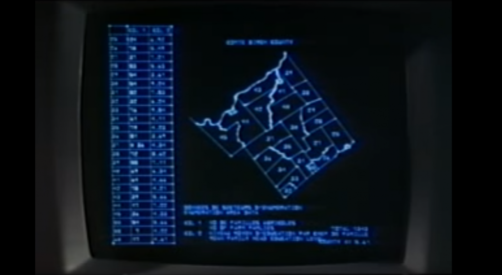
An early GIS system from the Canada Land Inventory, in Data for Decisions, 1967
Photo: Mbfleming. “Data for Decisions (1967).” YouTube, 12 Aug. 2007, https://youtu.be/ryWcq7Dv4jE.
Part 1, Part 2, Part 3
In 1969, Jack Dangermond founded Esri, which became the maker of, arguably, the world’s most popular commercial GIS software. Esri’s first commercial GIS, ARC/INFO, was released in 1982, and the simpler ArcView program followed in 1991. Many of today’s most skilled GIS software developers can trace their roots back to this original GIS software.
Back then, GIS work required expensive software packages installed on personal computers or large mainframe systems. There was no Google Maps; all map data had to be manually loaded into your software. Getting useful data into a GIS usually required extensive file manipulation and expertise in coordinate systems, projections, and geodesy.
While the government, utility, and resource management sectors used GIS heavily, there was not much consumer or personal use of GIS. Early GIS professionals spent much of their time digitizing paper maps by hand or trying to figure out why the map data loaded into a GIS was not lining up properly with an aerial photo. This may sound familiar to those who have been in the environmental industry for awhile.
The Google Revolution
How much has changed since those early days! After the release of OpenStreetMap in 2004, Google Maps and Google Earth in 2005, and Google Street View in 2007, GIS has been on an unstoppable journey—from only being used by dedicated GIS professionals on large computers in specific workplaces, to be accessible to anyone with an internet browser or a smartphone. High-quality map data and images—often the most expensive item in a GIS project in the 1990’s — are now practically free.
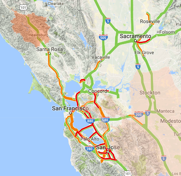
Just think how revolutionary it is that anyone can have instant access to detailed satellite images and road maps of almost anywhere on Earth! Not only can you perform such mundane tasks as finding the fastest route between two cities or locating your favorite coffee shop while on vacation—you can also see live traffic conditions for cities across the globe; view aerial images of countries you have never visited; track waste drums around your facility; and get street level views of exotic places. Back in 1991, such widespread access to free map data would have seemed like something straight out of science fiction.
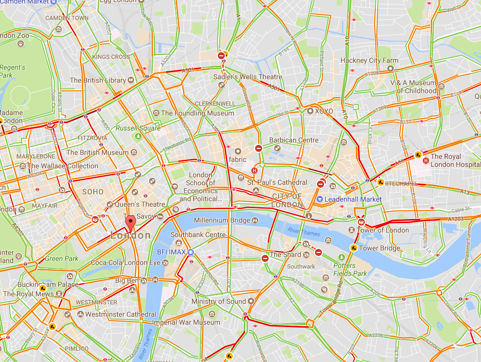
Traffic conditions in London, 3:30 pm 10/16/2017, from Google Maps

South Base Camp, Mount Everest, Google StreetView
Mashups in the cloud
Obviously, the amount of spatial data needed to provide detailed coverage of the entire globe is far too large to be stored on one laptop or phone. Instead, the data is distributed across many servers “in the cloud.” Back in the 1990s, everything for one GIS system (data, processing engine, user interface) needed to be in the same physical place—usually one hard drive or server. Now, thanks to the internet and cloud computing, the data can be separate from the software, creating “distributed” GIS.
The combination of freely available data with distributed GIS and the power of smart phones has led us to the age of “neogeography”—in which anyone (with some technical knowledge) can contribute to online maps, or host their maps with data relevant to their personal or professional needs. GIS no longer requires expensive software or cartographical expertise; now, even casual users can create maps linking multiple data sources, all in the cloud.
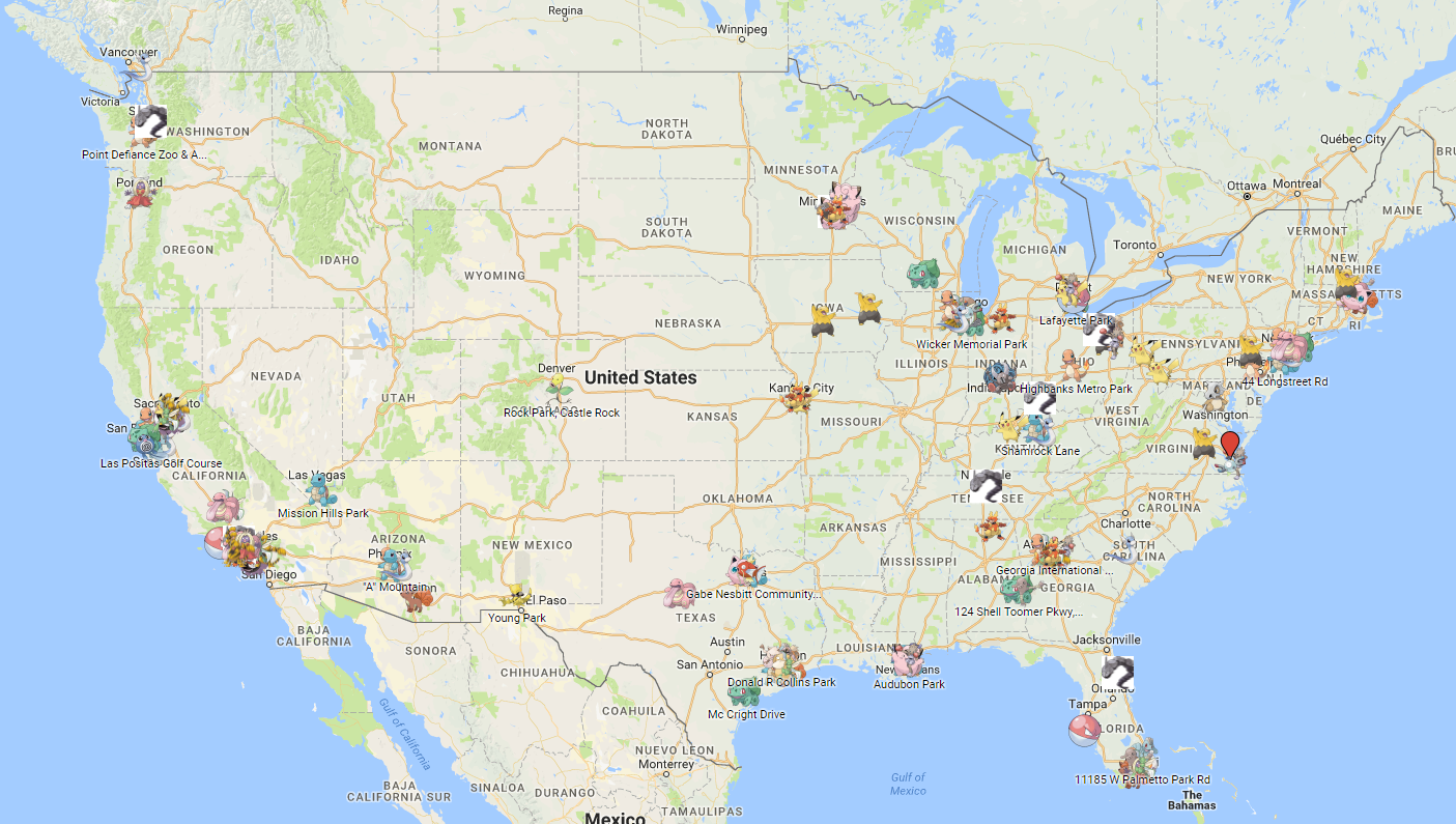
Google’s MyMaps is an example of a tool for easily making your maps. Maps can range from the playful, such as locations of “Pokemon nests,” to the serious, such as wildfire conditions.
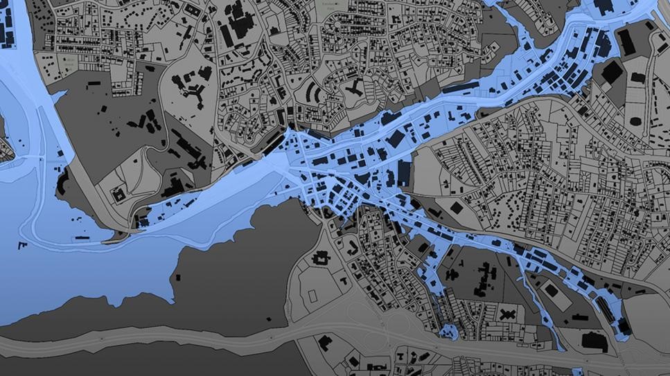
These online maps can be updated in real time (unlike paper maps) and therefore kept current with actual conditions. Such immediate response is instrumental in emergency management, where conditions can change rapidly, and both first responders and the public need access to the latest data.
Furthermore, software programmers have created online GIS tools that let non-coders create their maps. These tools push the boundaries of distributed GIS even further by putting the processing engine in the cloud with the data. Only the user interface runs locally for a given user. During this period of GIS history, it became easy to create “mashups” for viewing different types of disparate data at once, such as natural hazard risks near offices, pizza stores near one’s neighborhood, EPA Superfund sites near one’s home, property lines, flood plains, landslide vulnerability, and wildfire risk.
Programming GIS with APIs
Another significant advance in GIS technology is the ability to integrate or include advanced GIS tools and features in other computer programs. Companies such as Google and Esri have provided toolkits (called APIs, or application programming interfaces) that let coders access GIS data and functions inside their programs. While neogeography shows the power of personal maps created by the untrained public, computer programmers can use APIs to create some very sophisticated online GIS tools aimed at specific professionals or the public.
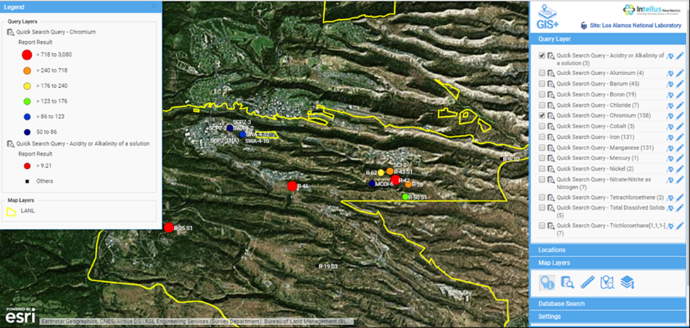
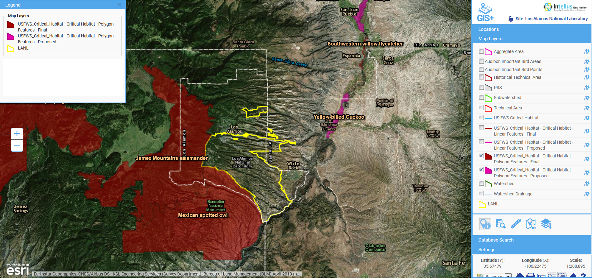
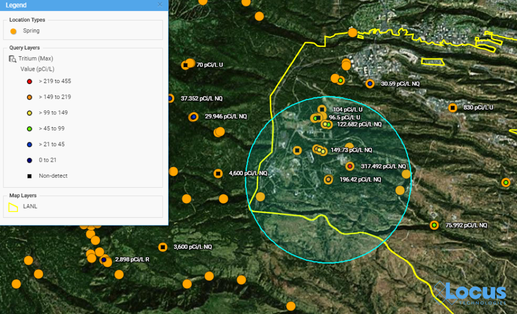
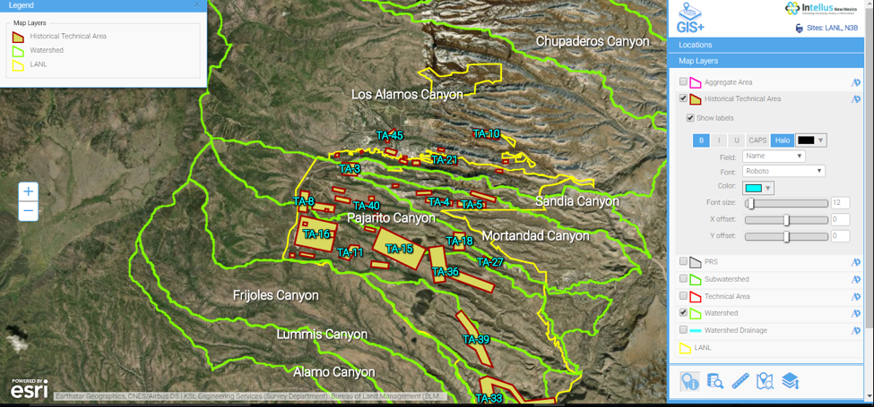
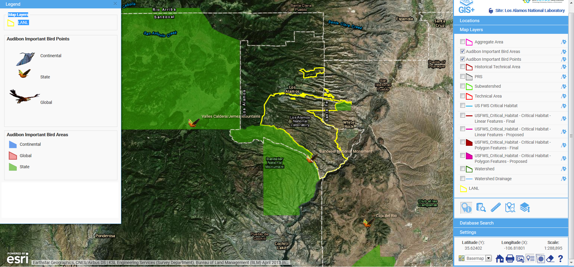
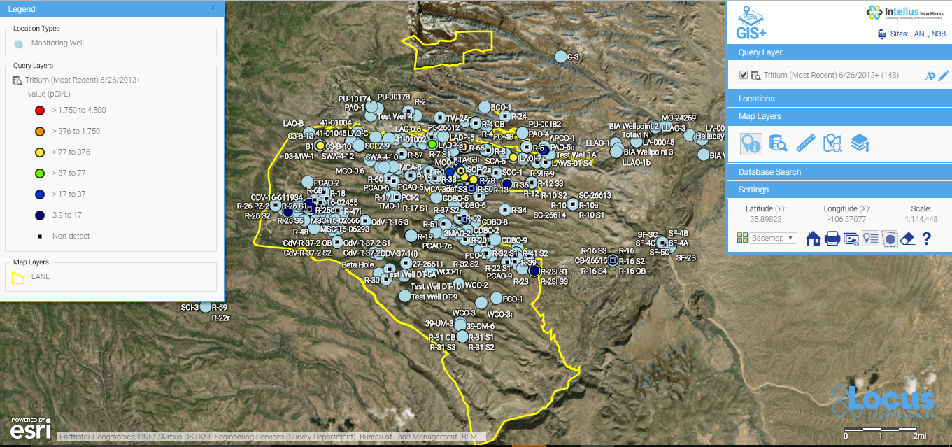
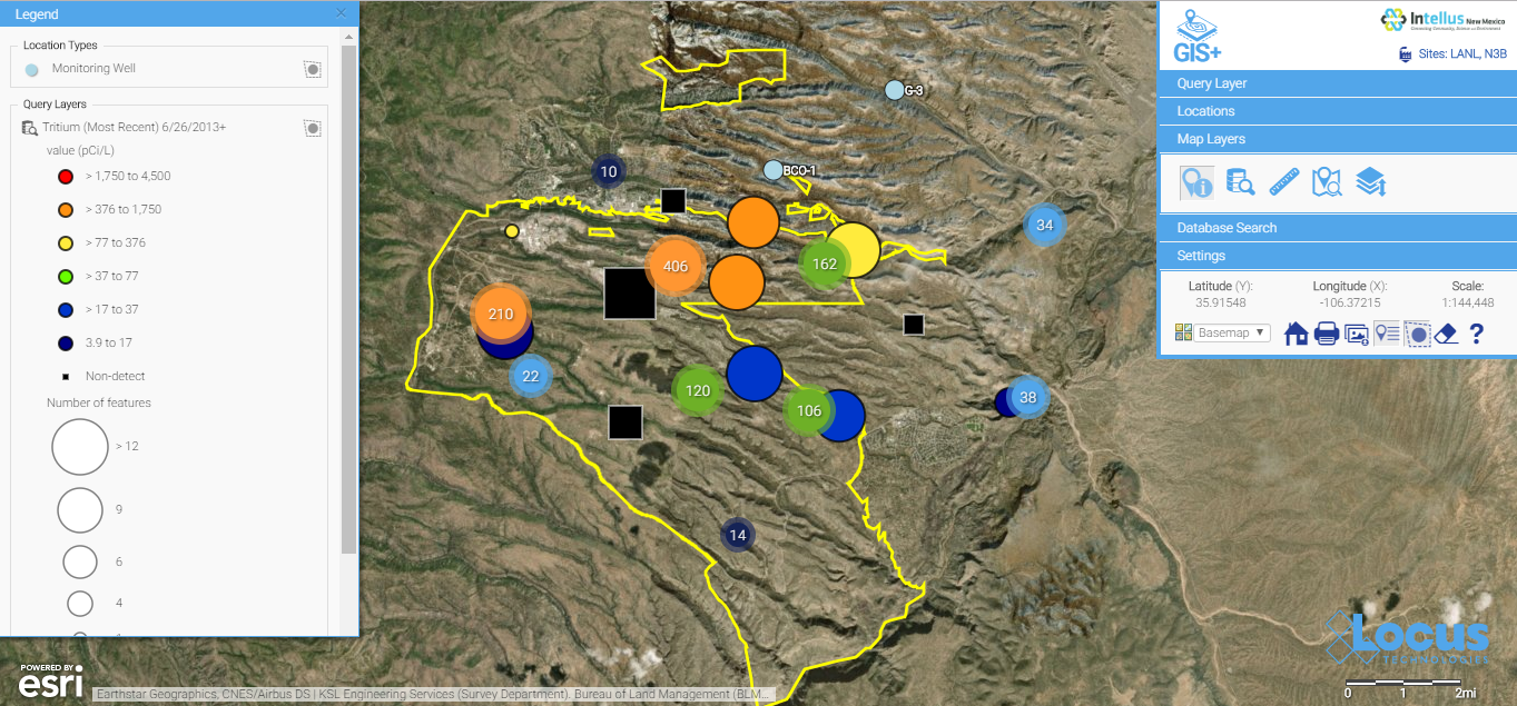
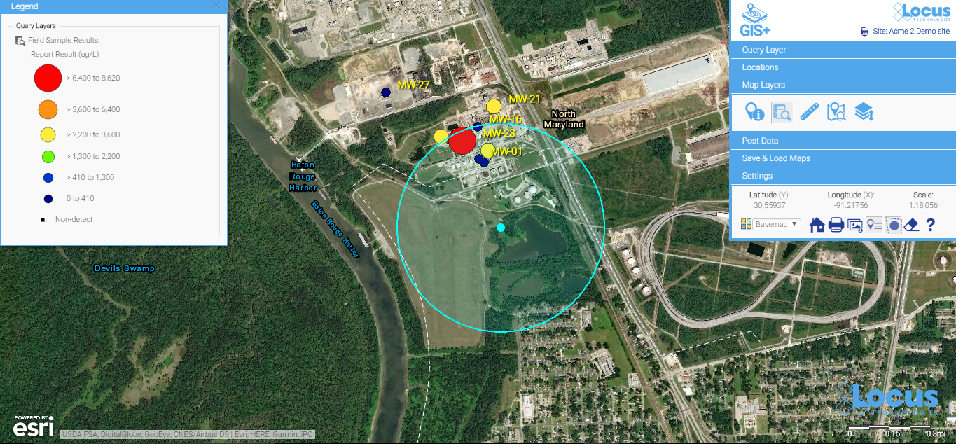
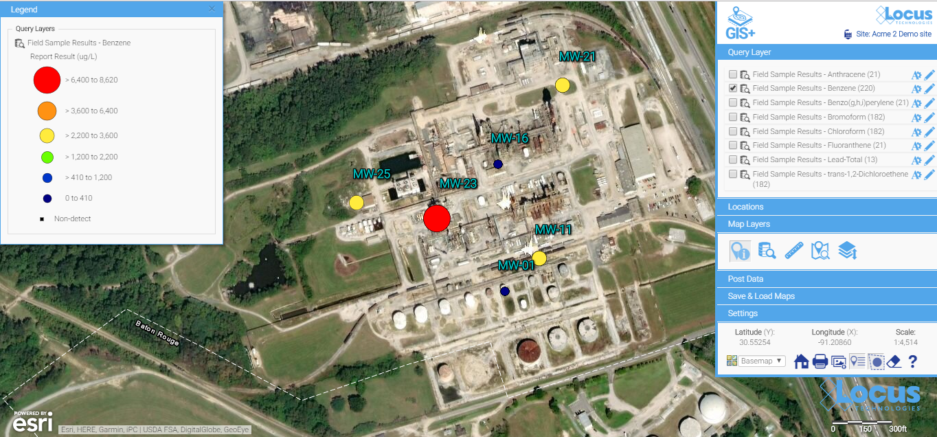
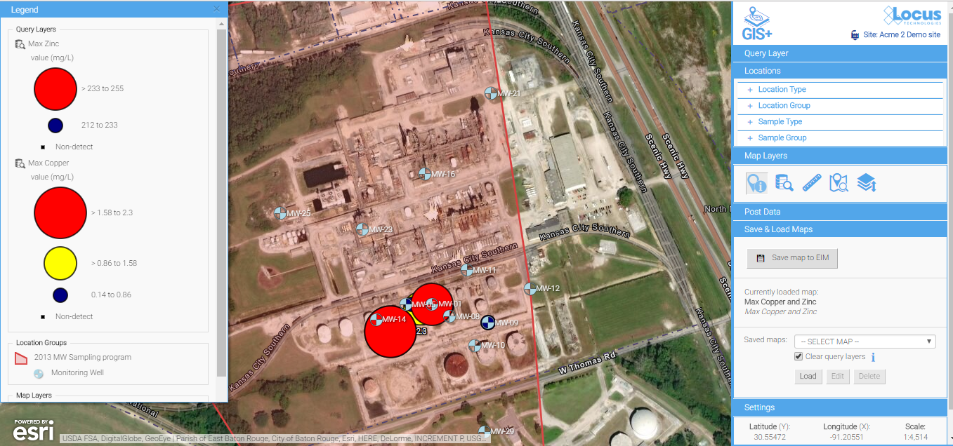
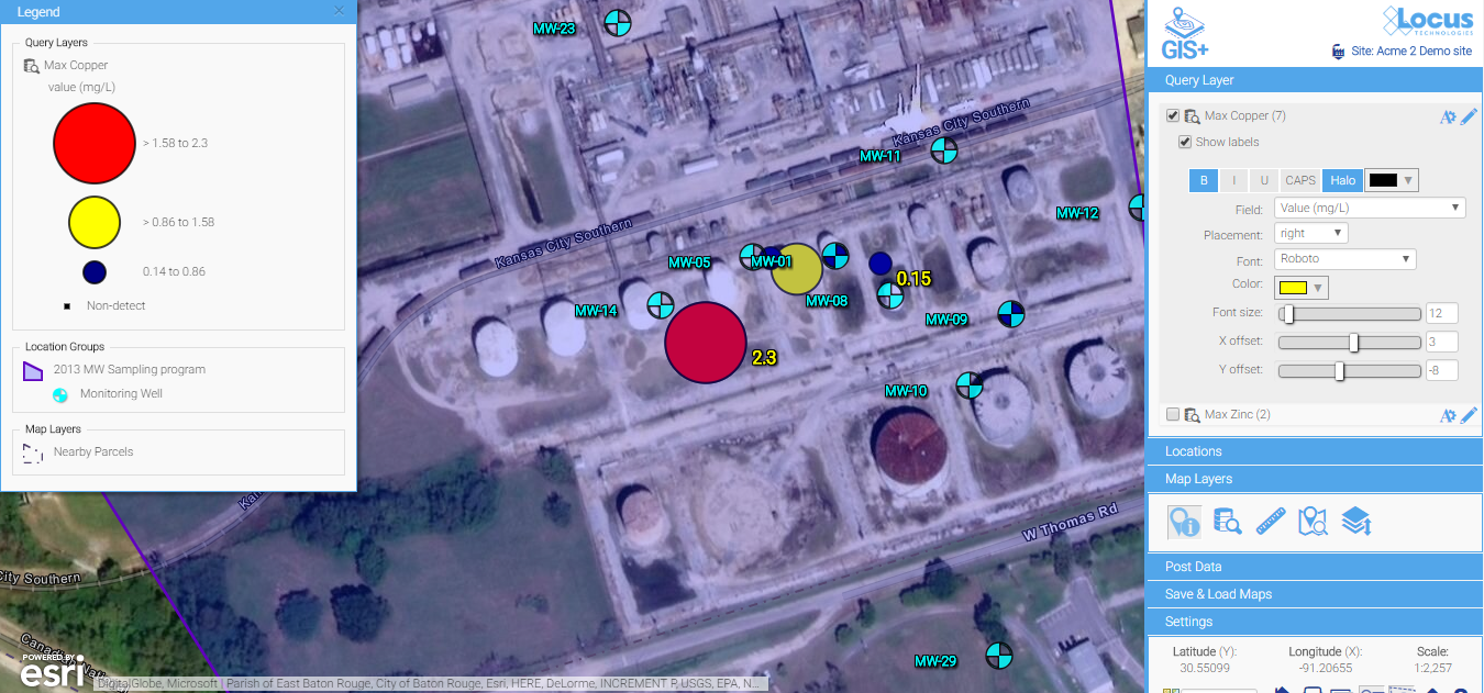
One example is the publicly-available Intellus application that Locus Technologies developed and hosts for the US Department of Energy’s Los Alamos National Laboratory. It uses an Esri API and distributed GIS to provide access to aerial images and many decades of environmental monitoring data for the Los Alamos, NM area. Users can make maps showing chemical concentrations near their home or workplace, and they can perform powerful spatial searches (e.g., “find all samples taken within one mile of my house in the last year”). The results can be color-coded based on concentration values to identify “hot spots”.
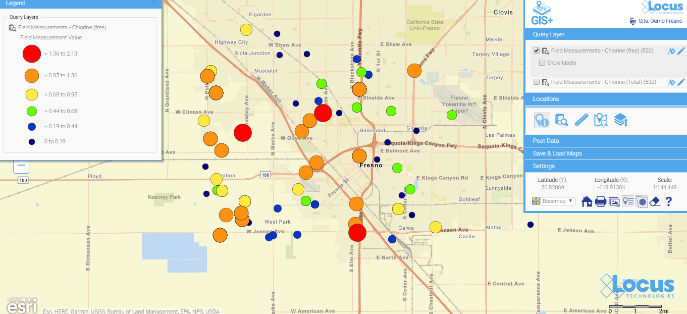
Another example of more sophisticated forms of analysis is integration of GIS with environmental databases. Many government facilities and private vendors incorporate GIS with online data systems to let public users evaluate all types of information they find relevant.
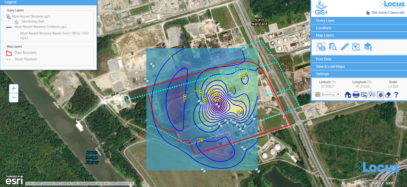
For example, contour lines can be generated on a map showing constant values of groundwater elevation, which is useful for determining water flow below ground. With such powerful spatial tools in the cloud, any facility manager or scientist can easily create and share maps that provide insight into data trends and patterns at their site.
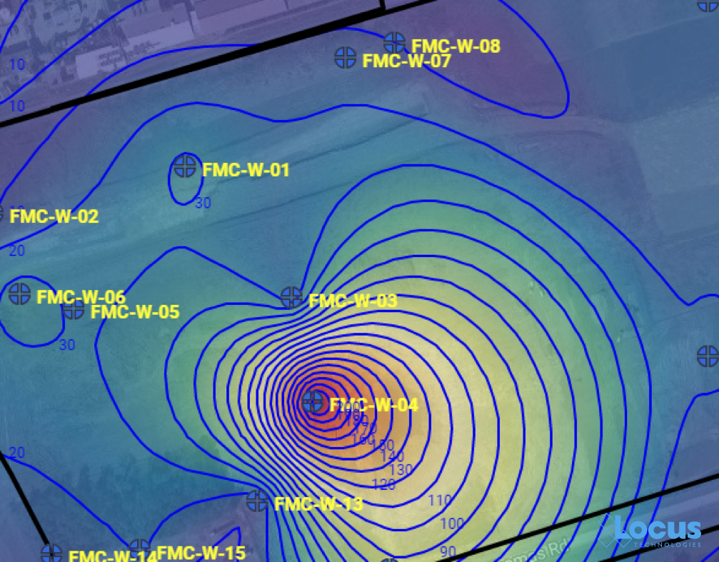
Groundwater contour map where each line is a 10 ft. interval, from the Locus EIM system
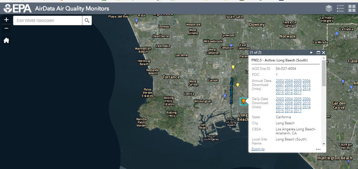
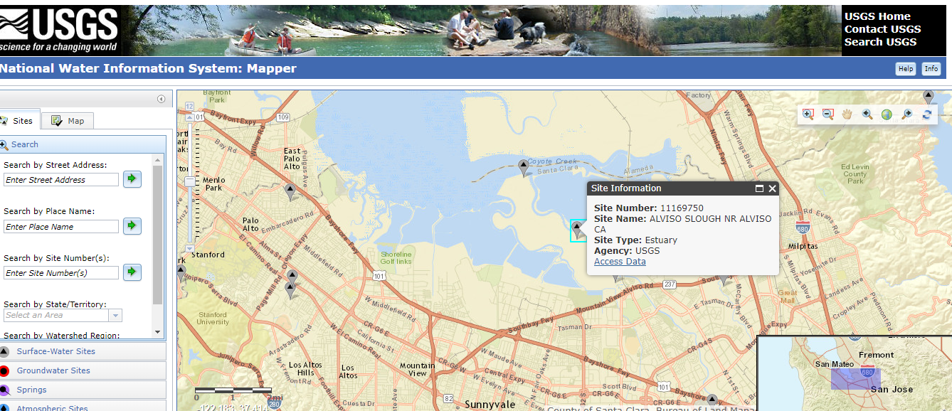
Other examples include monitoring air emissions at monitoring sites (like US EPA’s AirData Air Quality Monitors, shown below) and actual stream conditions from the USGS (also shown below).
There’s a (map) app for that
One particularly exciting aspect of GIS today is the ability to use GIS on a smartphone or tablet. The GIS APIs mentioned above usually have versions for mobile devices, as well as for browsers. Programmers have taken advantage of these mobile APIs, along with freely available map data from the cloud, to create apps that seamlessly embed maps into the user experience. By using a smartphone’s ability to pinpoint your current latitude and longitude, these apps can create personalized maps based on your actual location.
A search in the Apple AppStore for “map” returns thousands of apps with map components. Some of these apps put maps front-and-center for traditional navigation, whether by car (Waze, MapQuest, Google), public transit (New York Subway MTA Map, London Tube Map), or on foot (Runkeeper, Map My Run, AllTrails). Other apps use maps in a supporting role to allow users to find nearby places; for example, banking apps usually have a map to show branches near your current location.
What’s really exciting are the apps that allow users to enter data themselves via a map interface. For example, HealthMap’s Outbreaks Near Me not only shows reports of disease outbreaks near your location, but it also lets you enter unreported incidents. The GasBuddy app shows the latest gasoline prices and lets you enter in current prices. This “crowdsourcing” feature keeps an app up-to-date by letting its users update the map with the latest conditions as they are happening.
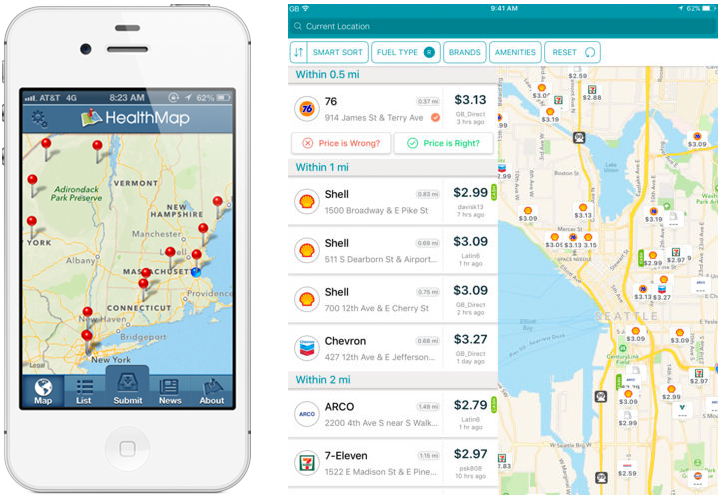
The Outbreaks Near Me app for phones (left) and the GasBuddy app for tablets (right)
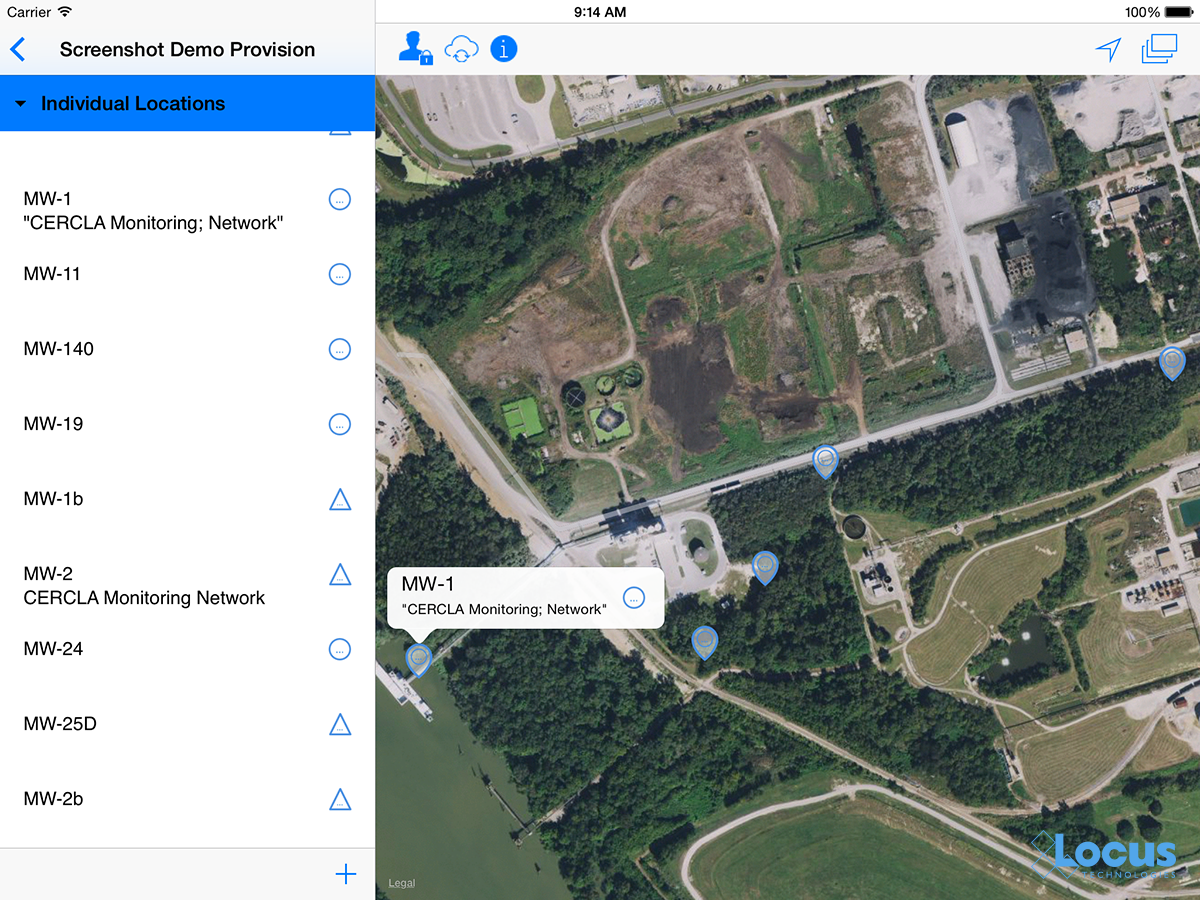
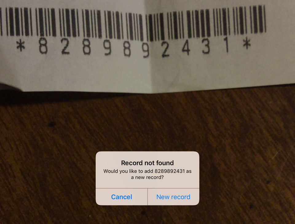
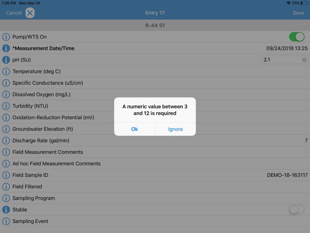
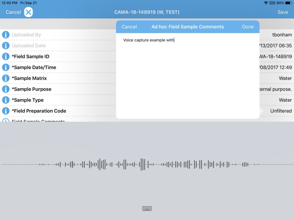
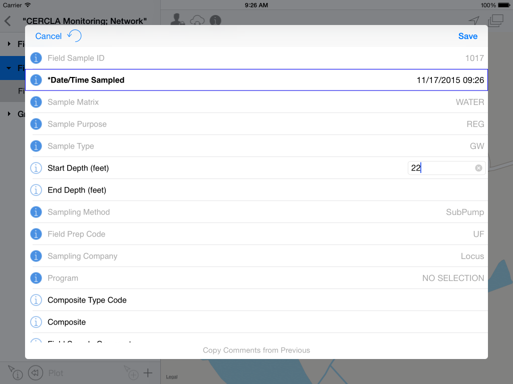
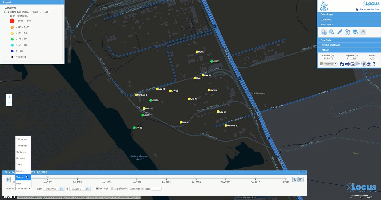
EHS professionals can further harness the power of GIS using mobile applications. For example, in the Locus Mobile app for field data collection, users can enter environmental data—such as temperature or pH measurements—from a sampling location, then upload the data back to cloud-based environmental management software for immediate review and analysis. Mobile apps can also support facility compliance audits, track current locations of hazardous waste drums, collect on-scene incident data (complete with photos), and record exact locations for mapping by colleagues back in the office.
GIS-enabled mobile apps also typically include a map interface for navigating to data collection points and tracking visited locations. Other key features to look for include ad hoc location creation for capturing unplanned data—this lets users create new data collection points “on the fly” simply by clicking on the map.
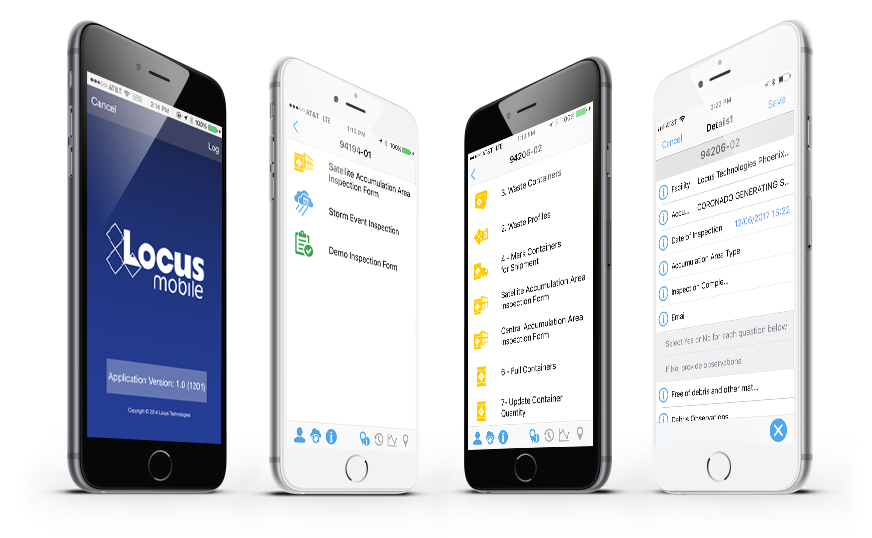
Views of many different mobile app use cases from tracking drums to collecting field data
A bright future for GIS applications within EHS software
Where will GIS as a whole go from here? It’s possible that augmented reality, virtual reality, and 3D visualization will continue to expand and become as ubiquitous as the current “2D” maps on browsers and phones. Also, the “internet of things” will surely have a GIS component because every physical “thing” can be tied to a geographical location. Similarly, GIS can play an important role in “big data” by providing the spatial framework for analysis.
GIS is one of the most effective ways to convey information to a wide range of users, from corporate managers looking at the company’s key metrics to operational personnel looking for incidents across facilities and trying to find trends. It is a highly intuitive data query interface that empowers users to explore the data hidden deep in enterprise EHS databases. The examples presented above are just the tip of the iceberg for the range of possibilities to simplify communication of information and look more broadly across enterprises to identify where real or potential issues lie.
An EHS software system should have many ways to extract data and information to form insights beyond a few “canned” reports and charts. A spatially-accurate picture can often provide more actionable insight than tables and text. Imagine being able to see spill locations, incident locations, environmental monitoring stations for air quality, wastewater outfalls, central and satellite waste accumulation area locations, and PCB and asbestos equipment and/or storage locations—all visually represented on an actual map of your facility and its surroundings. All these types of maps are invaluable in an enterprise EHS software system and should be a critical item on your checklist when selecting software for your EHS needs.
Thanks to the GIS Timeline for providing some of the history for this article.
 About guest blogger— Dr. Todd Pierce, Locus Technologies
Dr. Pierce manages a team of programmers tasked with development and implementation of Locus’ EIM application, which lets users manage their environmental data in the cloud using Software-as-a-Service technology. Dr. Pierce is also directly responsible for research and development of Locus’ GIS (geographic information systems) and visualization tools for mapping analytical and subsurface data. Dr. Pierce earned his GIS Professional (GISP) certification in 2010.
[jwplayer mediaid=”16590″]
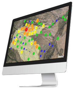
Interested in Locus’ GIS solutions?
Introducing Locus GIS+. All the functionality you love in EIM’s classic Google Maps GIS for environmental management— now integrated with the powerful cartography, interoperability, & smart-mapping features of Esri’s ArcGIS platform!
Learn more about GIS+
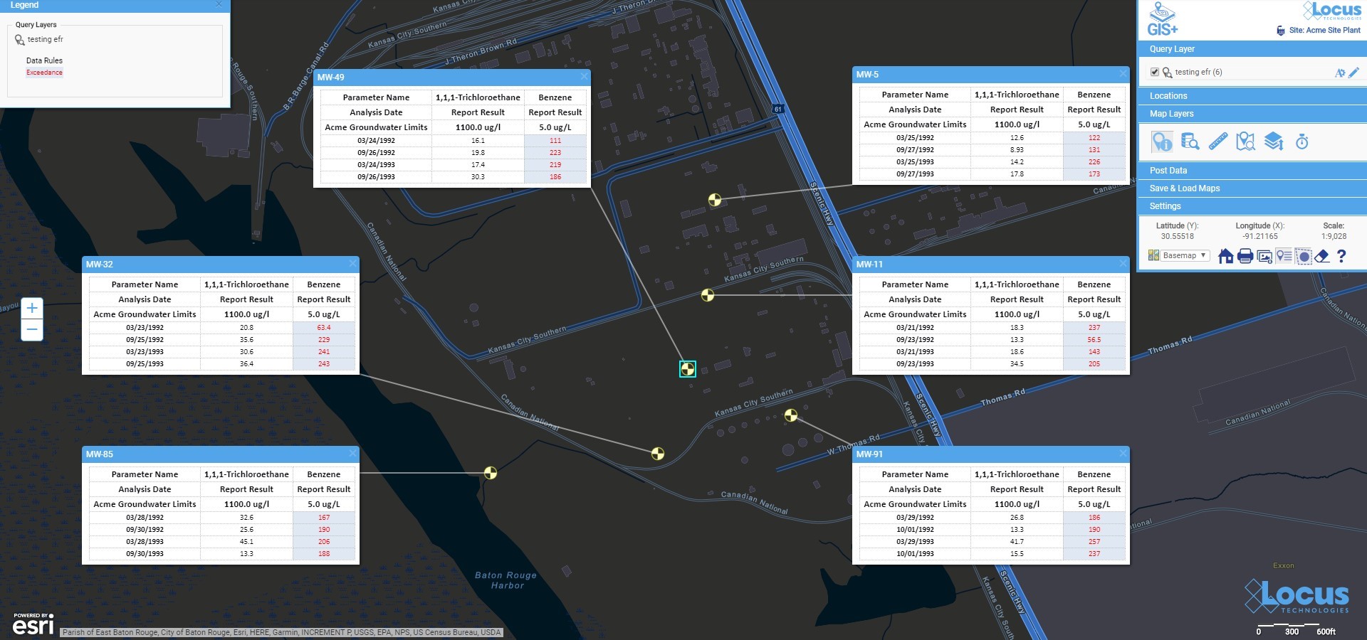
 See your data in new ways with Locus GIS for environmental management.
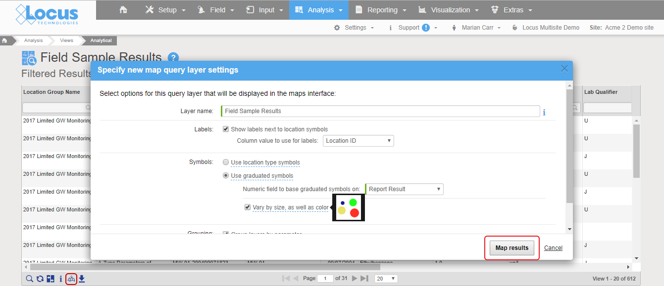
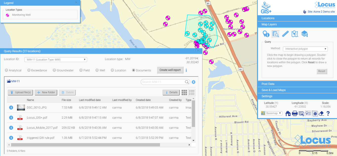
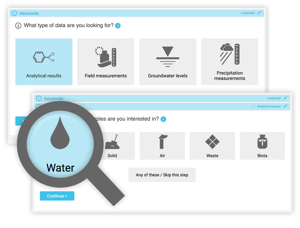 While a knowledgeable environmental scientist may be able to easily navigate a highly technical system, that same operation is bound to be far more difficult for a layperson interested in what chemicals are in their water. Constructing the right query is not as simple as looking for a chemical in water—it really matters what type of water you want to look within. On the Intellus website (showing the environmental data from the LANL site), there are 16 different types of water (not including “water levels”). Using the latest web technologies and our domain expertise, Locus created a much easier way to get to the data of interest.